Notice: This page requires JavaScript to function properly.
Please enable JavaScript in your browser settings or update your browser.
Lære Barplot | Categorical Plot Types
Deep Dive into the seaborn Visualization

book
Barplot

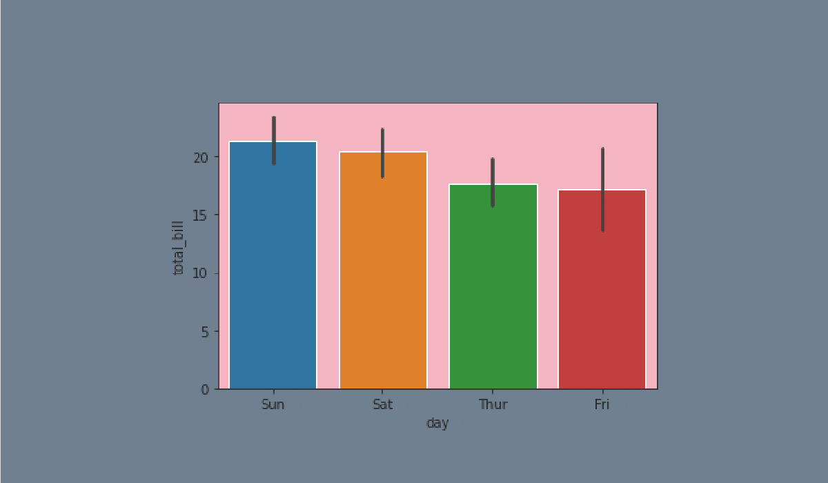
A barplot represents an estimate of the central tendency for a numeric variable with the height of each rectangle and provides some indication of the uncertainty around that estimate using error bars.

Bar plots include 0 in the quantitative axis range, and they are a good choice when 0 is a meaningful value for the quantitative variable, and you want to make comparisons against it.

carousel-imgcarousel-imgcarousel-imgcarousel-imgcarousel-imgcarousel-imgcarousel-imgcarousel-imgcarousel-img
Opgave

Swipe to start coding
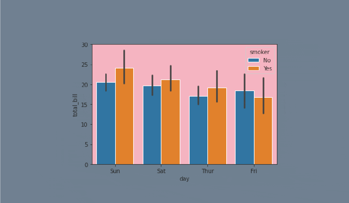
  1. Set the 'ticks' style.
  2. Create the barplot using the seaborn library:
  • Set the x parameter equals the 'day';
  • Set the y parameter equals the 'total_bill';
  • Set the hue parameter equals the 'smoker';
  • Set the linewidth parameter equals 2.5;
  • Set the capsize parameter equals 0.1;
  • Set the 'pink' errcolor parameter;
  • Set the 'magma' palette;
  • Set the data;
  • Display the plot.

Løsning

import warnings

# Ignore all warnings
warnings.filterwarnings('ignore')

# Importing libraries needed
import pandas as pd
import seaborn as sns
import matplotlib.pyplot as plt

# Reading the file
df = pd.read_csv('https://codefinity-content-media.s3.eu-west-1.amazonaws.com/66ba0c8e-8422-413c-b7e1-74bd24c61656/tips.csv')

# Set the 'ticks' style
sns.set_style('ticks')
# Create a barplot
sns.barplot(# Set the x
x = 'day',
# Set the y
y = 'total_bill',
# Set the hue
hue = 'smoker',
# Set the linewidth
linewidth = 2.5,
# Set the capsize
capsize = 0.1,
# Set the errcolor
errcolor = 'pink',
# Set the palette
palette = 'magma',
# Set the data
data = df)

# Display the plot
plt.show()

Var alt klart?

Hvordan kan vi forbedre det?

Tak for dine kommentarer!

Sektion 3. Kapitel 5
import warnings

# Ignore all warnings
warnings.filterwarnings('ignore')

# Importing libraries needed
import pandas as pd
import seaborn as sns
import matplotlib.pyplot as plt

# Reading the file
df = pd.read_csv('https://codefinity-content-media.s3.eu-west-1.amazonaws.com/66ba0c8e-8422-413c-b7e1-74bd24c61656/tips.csv')

# Set the 'ticks' style
___
# Create a barplot
___(# Set the x
___,
# Set the y
y = '___',
# Set the hue
___,
# Set the linewidth
___ = 2.5,
# Set the capsize
___ = ___,
# Set the errcolor
___ = '___',
# Set the palette
___,
# Set the data
___)

# Display the plot
___

Spørg AI

expand
ChatGPT

Spørg om hvad som helst eller prøv et af de foreslåede spørgsmål for at starte vores chat

some-alt