Building a Card Component
Swipe um das Menü anzuzeigen
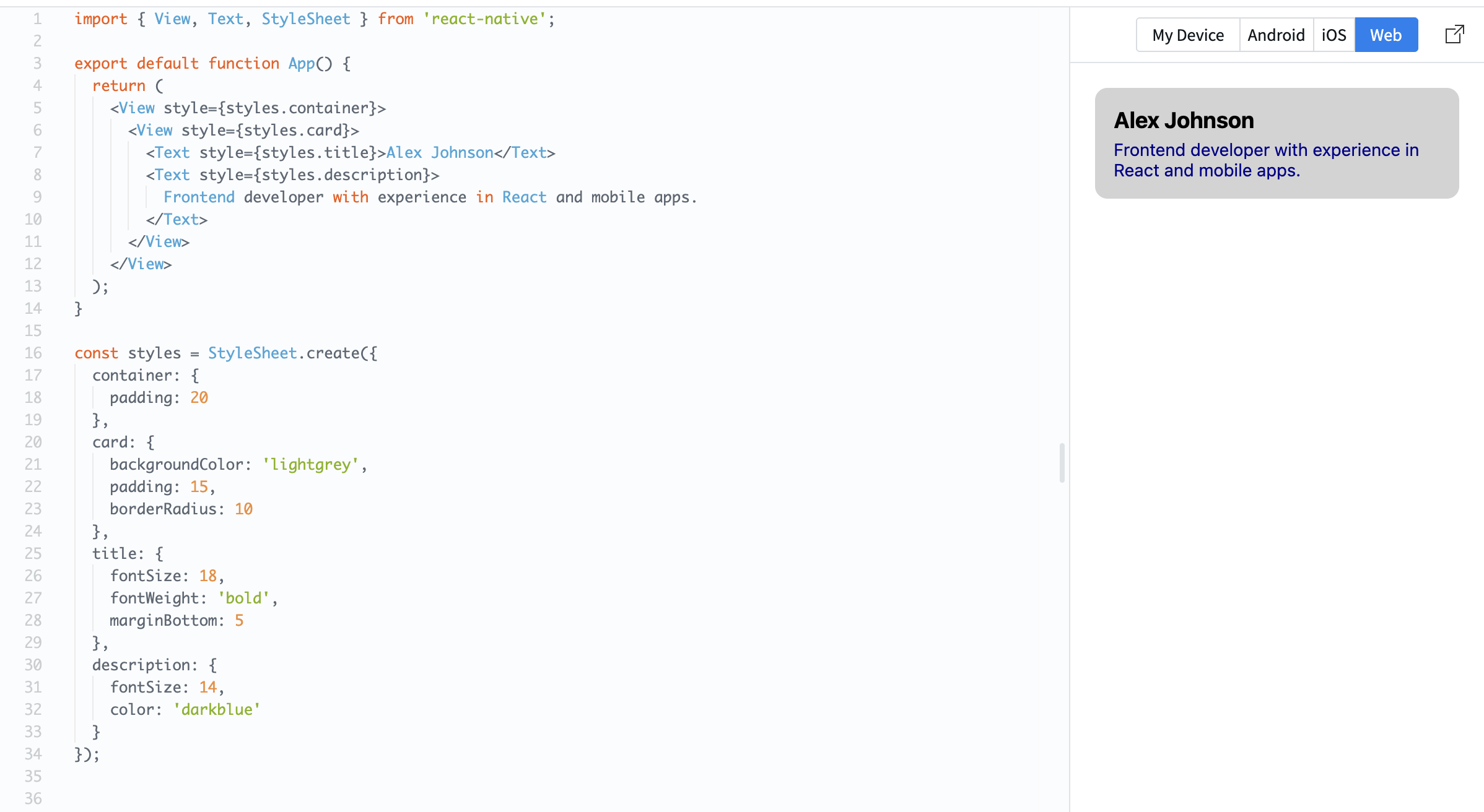
Now you will build your first reusable UI element — a card.
A card is a container that groups related content together. It usually has spacing, a background, and structured text.
Example:
import { View, Text, StyleSheet } from 'react-native';

export default function App() {
  return (
    <View style={styles.container}>
      <View style={styles.card}>
        <Text style={styles.title}>Alex Johnson</Text>
        <Text style={styles.description}>
          Frontend developer with experience in React and mobile apps.
        </Text>
      </View>
    </View>
  );
}

const styles = StyleSheet.create({
  container: {
    padding: 20
  },
  card: {
    backgroundColor: 'lightgrey',
    padding: 15,
    borderRadius: 10
  },
  title: {
    fontSize: 18,
    fontWeight: 'bold',
    marginBottom: 5
  },
  description: {
    fontSize: 14,
    color: 'darkblue'
  }
});
Here:
- The card uses padding to create space inside;
- Text is structured into title and description;
- Rounded corners (
borderRadius) make it look cleaner.
Cards are widely used in real apps because they help organize content into clear sections.
Danke für Ihr Feedback!
Fragen Sie AI

Fragen Sie AI

Fragen Sie alles oder probieren Sie eine der vorgeschlagenen Fragen, um unser Gespräch zu beginnen
Building a Card Component
Now you will build your first reusable UI element — a card.
A card is a container that groups related content together. It usually has spacing, a background, and structured text.
Example:
import { View, Text, StyleSheet } from 'react-native';

export default function App() {
  return (
    <View style={styles.container}>
      <View style={styles.card}>
        <Text style={styles.title}>Alex Johnson</Text>
        <Text style={styles.description}>
          Frontend developer with experience in React and mobile apps.
        </Text>
      </View>
    </View>
  );
}

const styles = StyleSheet.create({
  container: {
    padding: 20
  },
  card: {
    backgroundColor: 'lightgrey',
    padding: 15,
    borderRadius: 10
  },
  title: {
    fontSize: 18,
    fontWeight: 'bold',
    marginBottom: 5
  },
  description: {
    fontSize: 14,
    color: 'darkblue'
  }
});
Here:
- The card uses padding to create space inside;
- Text is structured into title and description;
- Rounded corners (
borderRadius) make it look cleaner.
Cards are widely used in real apps because they help organize content into clear sections.
Danke für Ihr Feedback!
