Building a Card Component
Desliza para mostrar el menú
Now you will build your first reusable UI element — a card.
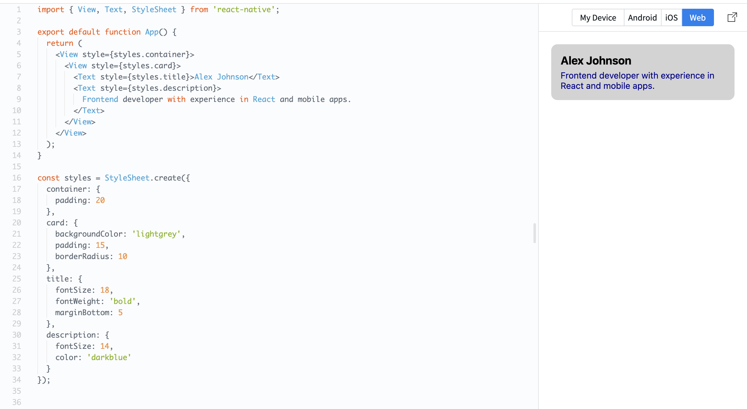
A card is a container that groups related content together. It usually has spacing, a background, and structured text.
Example:
import { View, Text, StyleSheet } from 'react-native';

export default function App() {
  return (
    <View style={styles.container}>
      <View style={styles.card}>
        <Text style={styles.title}>Alex Johnson</Text>
        <Text style={styles.description}>
          Frontend developer with experience in React and mobile apps.
        </Text>
      </View>
    </View>
  );
}

const styles = StyleSheet.create({
  container: {
    padding: 20
  },
  card: {
    backgroundColor: 'lightgrey',
    padding: 15,
    borderRadius: 10
  },
  title: {
    fontSize: 18,
    fontWeight: 'bold',
    marginBottom: 5
  },
  description: {
    fontSize: 14,
    color: 'darkblue'
  }
});
Here:
- The card uses padding to create space inside;
- Text is structured into title and description;
- Rounded corners (
borderRadius) make it look cleaner.
Cards are widely used in real apps because they help organize content into clear sections.
¡Gracias por tus comentarios!
Pregunte a AI

Pregunte a AI

Pregunte lo que quiera o pruebe una de las preguntas sugeridas para comenzar nuestra charla
Building a Card Component
Now you will build your first reusable UI element — a card.
A card is a container that groups related content together. It usually has spacing, a background, and structured text.
Example:
import { View, Text, StyleSheet } from 'react-native';

export default function App() {
  return (
    <View style={styles.container}>
      <View style={styles.card}>
        <Text style={styles.title}>Alex Johnson</Text>
        <Text style={styles.description}>
          Frontend developer with experience in React and mobile apps.
        </Text>
      </View>
    </View>
  );
}

const styles = StyleSheet.create({
  container: {
    padding: 20
  },
  card: {
    backgroundColor: 'lightgrey',
    padding: 15,
    borderRadius: 10
  },
  title: {
    fontSize: 18,
    fontWeight: 'bold',
    marginBottom: 5
  },
  description: {
    fontSize: 14,
    color: 'darkblue'
  }
});
Here:
- The card uses padding to create space inside;
- Text is structured into title and description;
- Rounded corners (
borderRadius) make it look cleaner.
Cards are widely used in real apps because they help organize content into clear sections.
¡Gracias por tus comentarios!
