single
Gráfico KDE
Desliza para mostrar el menú
Un gráfico de Estimación de Densidad de Kernel (KDE) es un tipo de gráfico que visualiza la función de densidad de probabilidad estimada de una variable continua. A diferencia de un histograma, que muestra los datos utilizando barras discretas agrupadas en intervalos, un gráfico KDE representa la distribución como una curva suave y continua basada en todos los puntos de datos.
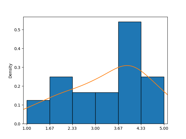
Este ejemplo muestra un histograma combinado con un gráfico KDE (curva naranja), proporcionando una aproximación más clara de la función de densidad de probabilidad que el histograma por sí solo.
En seaborn, la función kdeplot() facilita la creación de gráficos KDE. Sus parámetros principales—data, x y y—funcionan igual que en countplot().
Primera opción
Solo uno de los parámetros puede establecerse pasando una secuencia de valores, lo que permite la personalización individual de cada elemento.
123456789101112import pandas as pd import matplotlib.pyplot as plt import seaborn as sns # Loading the dataset with the average yearly temperatures in Boston and Seattle url = 'https://content-media-cdn.codefinity.com/courses/47339f29-4722-4e72-a0d4-6112c70ff738/weather_data.csv' weather_df = pd.read_csv(url, index_col=0) # Creating a KDE plot setting only the data parameter sns.kdeplot(data=weather_df['Seattle'], fill=True) plt.show()
El parámetro data se establece pasando un objeto Series, y el parámetro fill se utiliza para rellenar el área bajo la curva, que por defecto no está rellena.
Segunda opción
También es posible establecer un objeto 2D como un DataFrame para data y un nombre de columna o una clave si data es un diccionario para x (orientación vertical) o y (orientación horizontal):
123456789101112import pandas as pd import matplotlib.pyplot as plt import seaborn as sns # Loading the dataset with the average yearly temperatures in Boston and Seattle url = 'https://content-media-cdn.codefinity.com/courses/47339f29-4722-4e72-a0d4-6112c70ff738/weather_data.csv' weather_df = pd.read_csv(url, index_col=0) # Creating a KDE plot setting both the data and x parameters sns.kdeplot(data=weather_df, x='Seattle', fill=True) plt.show()
Se obtuvieron los mismos resultados al pasar el DataFrame completo como parámetro data y especificar el nombre de la columna para el parámetro x.
El gráfico KDE creado muestra una curva de campana característica, que se asemeja mucho a una distribución normal con una media alrededor de 52°F.
En caso de que desee explorar más sobre la función KDE plot, consulte la documentación de kdeplot().
Desliza para comenzar a programar
- Utilizar la función correcta para crear un gráfico KDE.
- Usar
countries_dfcomo los datos para el gráfico (el primer argumento). - Establecer
'GDP per capita'como la columna a utilizar y la orientación en horizontal mediante el segundo argumento. - Rellenar el área bajo la curva mediante el tercer argumento (el más a la derecha).
Solución
¡Gracias por tus comentarios!
single
Pregunte a AI
Pregunte a AI

Pregunte lo que quiera o pruebe una de las preguntas sugeridas para comenzar nuestra charla
