single
Gráfico de Pares
Desliza para mostrar el menú
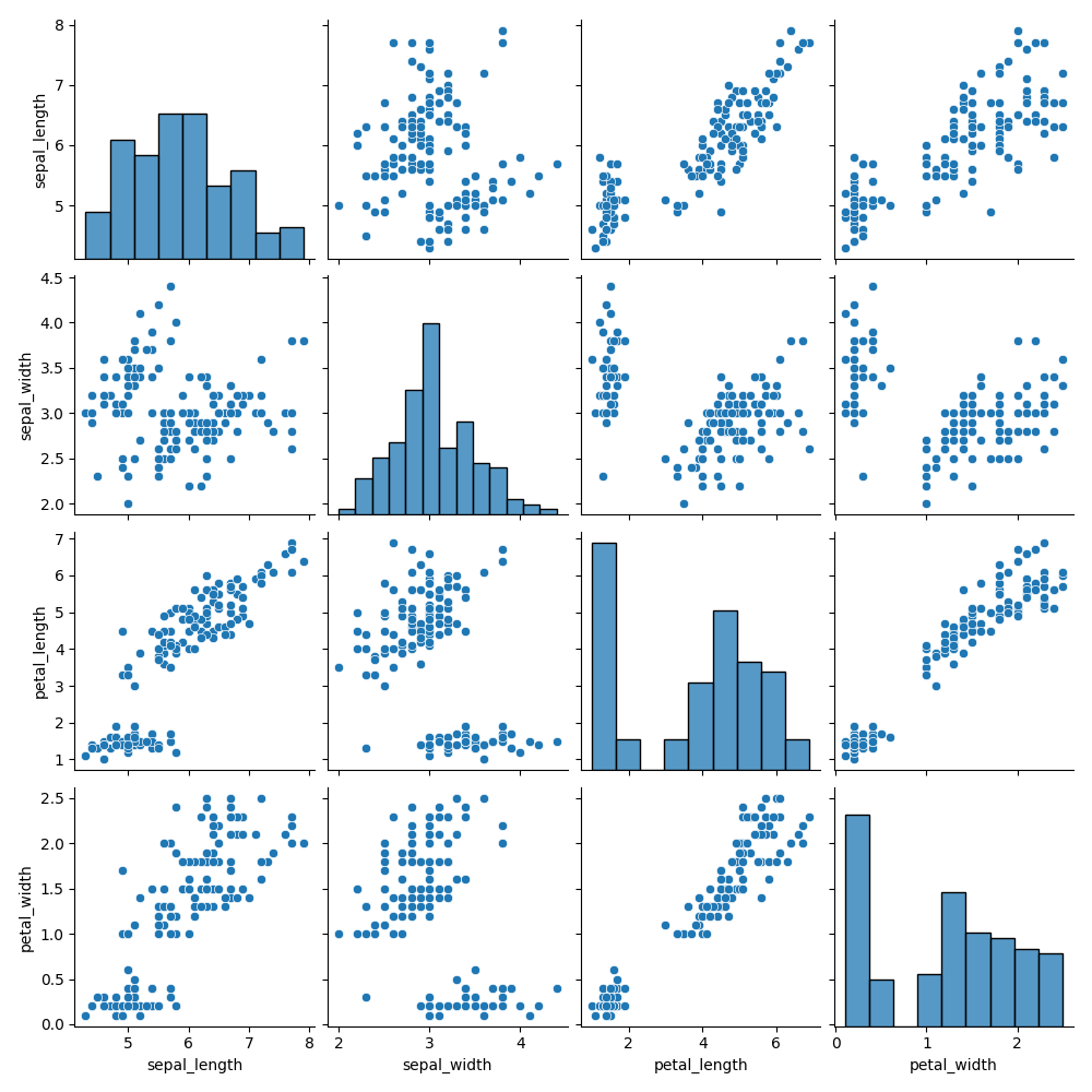
Un pair plot visualiza las relaciones por pares entre todas las variables numéricas de un conjunto de datos. A diferencia de un joint plot, no está limitado a dos variables. Crea una cuadrícula de subgráficos de N×N, donde N es el número de columnas numéricas en el DataFrame.
Descripción del Pair Plot
Cada columna en la cuadrícula comparte la misma variable del eje x, y cada fila comparte la misma del eje y. La diagonal muestra histogramas de variables individuales, mientras que las celdas fuera de la diagonal presentan diagramas de dispersión.
Creación de un Pair Plot
Se puede crear utilizando seaborn.pairplot(). Su único argumento obligatorio es data, que debe ser un DataFrame. Parámetros como height y aspect establecen el tamaño (en pulgadas) de cada subgráfico.
12345678910import seaborn as sns import matplotlib.pyplot as plt # Loading the dataset with data about three different iris species iris_df = sns.load_dataset('iris') # Creating a pair plot sns.pairplot(iris_df, height=2, aspect=0.8) plt.show()
Hue
El parámetro hue asigna colores en función de una columna categórica especificada. Esto resalta las diferencias entre grupos y, cuando se utiliza en conjuntos de datos de clasificación, muestra cómo se separan las clases en los pares de variables.
Con hue establecido (por ejemplo, en species), los diagramas de dispersión colorean los puntos por clase y los gráficos diagonales cambian de histogramas a gráficos KDE, lo que hace que las distribuciones de las clases sean más claras.
1234567891011121314import seaborn as sns import matplotlib.pyplot as plt # Ignoring warnings import warnings warnings.filterwarnings('ignore') # Loading the dataset with data about three different iris species iris_df = sns.load_dataset('iris') # Setting the hue parameter to 'species' sns.pairplot(iris_df, hue='species', height=2, aspect=0.8) plt.show()
Cambiar Tipos de Gráficas
Es posible personalizar tanto las gráficas principales como las diagonales.
kindcontrola las gráficas fuera de la diagonal (predeterminado:'scatter');diag_kindcontrola la diagonal (histograma o KDE, a menudo seleccionado automáticamente cuando se utilizahue).
12345678910import seaborn as sns import matplotlib.pyplot as plt # Loading the dataset with data about three different iris species iris_df = sns.load_dataset('iris') # Setting the kind parameter and diag_kind parameters sns.pairplot(iris_df, hue='species', kind='reg', diag_kind=None, height=2, aspect=0.8) plt.show()
'scatter', 'kde', 'hist', 'reg' son valores posibles para el parámetro kind.
diag_kind puede establecerse en uno de los siguientes valores:
'auto';'hist';'kde';None.
Todo es similar a la función jointplot() en este aspecto.
Explora más en la documentación de pairplot().
Desliza para comenzar a programar
- Utilizar la función correcta para crear un pair plot.
- Establecer los datos del gráfico como
penguins_dfmediante el primer argumento. - Definir
'sex'como la columna que asignará los aspectos del gráfico a diferentes colores especificando el segundo argumento. - Configurar los gráficos no diagonales para que incluyan una línea de regresión (
'reg') mediante el tercer argumento. - Establecer
heighten2. - Establecer
aspecten0.8.
Solución
¡Gracias por tus comentarios!
single
Pregunte a AI
Pregunte a AI

Pregunte lo que quiera o pruebe una de las preguntas sugeridas para comenzar nuestra charla
