single
Gráfico Conjunto
Desliza para mostrar el menú
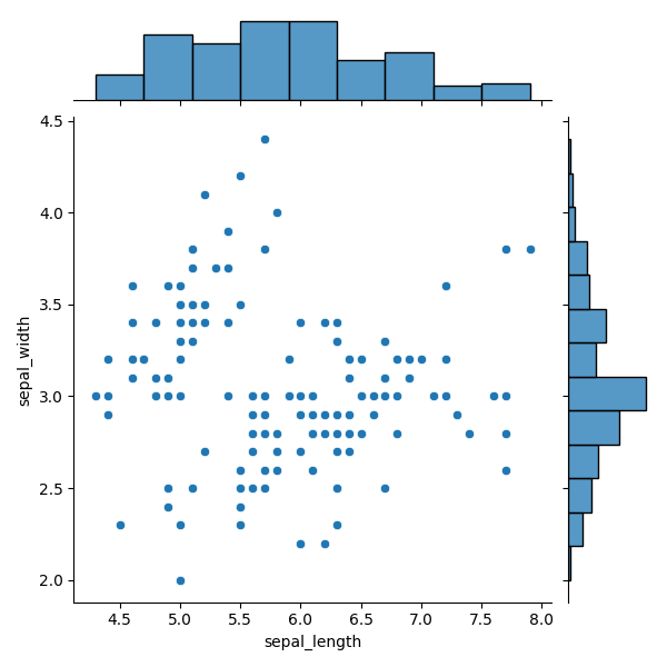
Gráfico conjunto es un tipo de gráfico bastante singular, ya que combina múltiples gráficos. Es una visualización que muestra la relación entre dos variables junto con sus distribuciones individuales.
Un gráfico conjunto combina tres elementos:
- un histograma en la parte superior (distribución de la variable x);
- un histograma a la derecha (distribución de la variable y);
- un diagrama de dispersión en el centro (relación entre las dos variables).
Aquí tienes un ejemplo:
Datos para el Joint Plot
seaborn.jointplot() utiliza tres parámetros clave:
data— el DataFrame,x— variable para el histograma superior,y— variable para el histograma derecho.
x y y pueden ser nombres de columnas u objetos tipo array.
12345678import seaborn as sns import matplotlib.pyplot as plt # Loading the dataset with data about three different iris flowers species iris_df = sns.load_dataset("iris") sns.jointplot(data=iris_df, x="sepal_length", y="sepal_width") plt.show()
El ejemplo se recrea pasando un DataFrame a data y especificando los nombres de las columnas para x y y.
Gráfico en el Centro
El parámetro kind controla el tipo de gráfico central.
Por defecto: 'scatter'.
Otras opciones incluyen: 'kde', 'hist', 'hex', 'reg', 'resid'.
12345678import seaborn as sns import matplotlib.pyplot as plt # Loading the dataset with data about three different iris flowers species iris_df = sns.load_dataset("iris") sns.jointplot(data=iris_df, x="sepal_length", y="sepal_width", kind='reg') plt.show()
Tipos de Gráficos
Además de scatter, se puede elegir:
- reg — agrega un ajuste de regresión lineal;
- resid — muestra los residuos de la regresión;
- hist — histograma bivariado;
- kde — KDE para dos variables;
- hex — gráfico hexbin que muestra la densidad usando hexágonos coloreados.
Como es habitual, se pueden explorar más opciones y parámetros en la documentación de jointplot().
También es recomendable explorar los siguientes temas:
documentación de residplot();
Ejemplo de histograma bivariado;
Ejemplo de gráfico hexbin.
Desliza para comenzar a programar
- Utilizar la función correcta para crear un joint plot.
- Usar
weather_dfcomo los datos para la gráfica (el primer argumento). - Establecer la columna
'Boston'como la variable del eje x (el segundo argumento). - Establecer la columna
'Seattle'como la variable del eje y (el tercer argumento). - Configurar la gráfica central para que tenga una línea de regresión (el argumento más a la derecha).
Solución
¡Gracias por tus comentarios!
single
Pregunte a AI
Pregunte a AI

Pregunte lo que quiera o pruebe una de las preguntas sugeridas para comenzar nuestra charla
