single
Personalización de Ejes
Desliza para mostrar el menú
Personalización de Ticks
Para personalizar los ticks, utilice:
xtickspara el eje x,ytickspara el eje y.
Ambos aceptan:
ticks— posiciones de los ticks (una lista vacía elimina los ticks);labels— texto personalizado para esas posiciones.
Argumentos adicionales permiten estilizar las etiquetas de los ticks (por ejemplo, rotación, tamaño de fuente).
A continuación se muestra un gráfico utilizando estas herramientas:
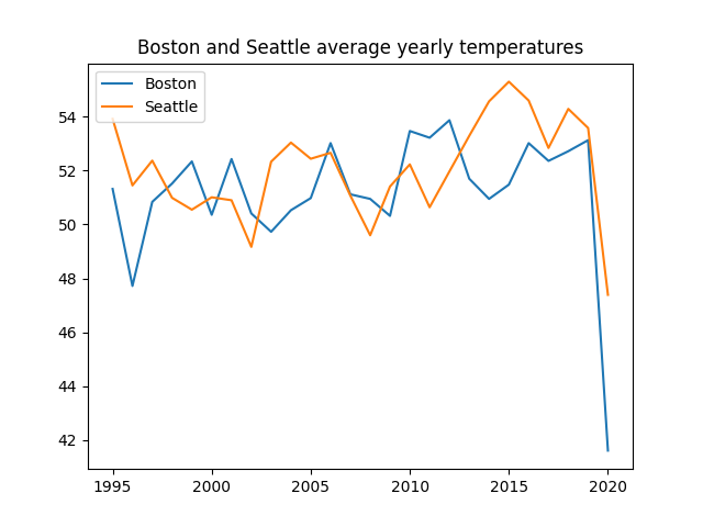
Todo parece estar bastante bien con este gráfico, sin embargo, sería mejor tener más años en el eje x en este rango (1995-2020). Utilicemos xticks() para este propósito:
123456789101112131415import pandas as pd import matplotlib.pyplot as plt url = 'https://staging-content-media-cdn.codefinity.com/courses/47339f29-4722-4e72-a0d4-6112c70ff738/weather_data.csv' weather_df = pd.read_csv(url, index_col=0) plt.plot(weather_df['Boston'], label='Boston') plt.plot(weather_df['Seattle'], label='Seattle') plt.title('Boston and Seattle average yearly temperatures') plt.legend(loc='upper left') plt.xticks(range(1995, 2021, 2), rotation=30) plt.show()
Cada dos años se muestra en el eje x gracias a range(1995, 2021, 2).
Las etiquetas están rotadas 30° para mejorar la legibilidad.
Las etiquetas de las marcas también pueden establecerse manualmente pasando una lista a labels.
Personalización de etiquetas de ejes
Utilizar xlabel() y ylabel() para establecer las etiquetas de los ejes. Cada una recibe una sola cadena de texto.
123456789101112131415import pandas as pd import matplotlib.pyplot as plt url = 'https://content-media-cdn.codefinity.com/courses/47339f29-4722-4e72-a0d4-6112c70ff738/weather_data.csv' weather_df = pd.read_csv(url, index_col=0) plt.plot(weather_df['Boston'], label='Boston') plt.plot(weather_df['Seattle'], label='Seattle') plt.title('Boston and Seattle average yearly temperatures') plt.legend(loc='upper left') plt.xticks(range(1995, 2021, 2), rotation=30) plt.ylabel('Temperature, °F') plt.show()
Puede personalizar las etiquetas con opciones como fontsize y color.
El argumento loc controla la ubicación de la etiqueta:
- Para etiquetas del eje x:
'left','center','right'; - Para etiquetas del eje y:
'top','center','bottom'.
Desliza para comenzar a programar
- Utilizar la función adecuada para establecer
data_linearcomo los valores de las marcas del eje x. - Utilizar la función adecuada para establecer
'x'como la etiqueta del eje x. - Utilizar
'right'como la ubicación para la etiqueta del eje x. - Utilizar la función adecuada para establecer
'y'como la etiqueta del eje y. - Utilizar
'top'como la ubicación para la etiqueta del eje y. - Establecer el parámetro
rotationen0para la etiqueta del eje y.
Solución
¡Gracias por tus comentarios!
single
Pregunte a AI
Pregunte a AI

Pregunte lo que quiera o pruebe una de las preguntas sugeridas para comenzar nuestra charla
