Layout with Flexbox
Pyyhkäise näyttääksesi valikon
React Native uses Flexbox to control layout.
Flexbox helps you position elements on the screen.
The most important properties are:
flexDirection: layout direction;justifyContent: alignment on the main axis;alignItems: alignment on the cross axis.
Example:
import { View, Text, Image, StyleSheet } from 'react-native';

export default function App() {
  return (
    <View style={styles.container}>
      <Text style={styles.title}>Profile</Text>

      <View style={styles.row}>
        <Image
          source={{ uri: 'https://i.pravatar.cc/150' }}
          style={styles.avatar}
        />

        <View>
          <Text style={styles.name}>Alex Johnson</Text>
          <Text>Frontend Developer</Text>
        </View>
      </View>
    </View>
  );
}

const styles = StyleSheet.create({
  container: {
    padding: 20
  },
  title: {
    fontSize: 20,
    marginBottom: 10
  },
  row: {
    flexDirection: 'row',
    alignItems: 'center'
  },
  avatar: {
    width: 80,
    height: 80,
    marginRight: 10
  },
  name: {
    fontSize: 18
  }
});
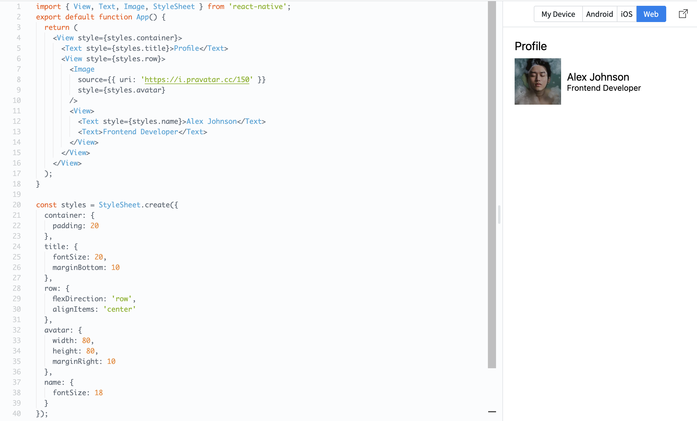
Here, flexDirection: 'row' places items side by side, and alignItems: 'center' aligns them vertically.
Flexbox is essential because it controls how your layout looks on different screen sizes.
Oliko kaikki selvää?
Kiitos palautteestasi!
Osio 1. Luku 5
Kysy tekoälyä

Kysy tekoälyä

Kysy mitä tahansa tai kokeile jotakin ehdotetuista kysymyksistä aloittaaksesi keskustelumme
Osio 1. Luku 5
