Layout with Flexbox
Glissez pour afficher le menu
React Native uses Flexbox to control layout.
Flexbox helps you position elements on the screen.
The most important properties are:
flexDirection: layout direction;justifyContent: alignment on the main axis;alignItems: alignment on the cross axis.
Example:
import { View, Text, Image, StyleSheet } from 'react-native';

export default function App() {
  return (
    <View style={styles.container}>
      <Text style={styles.title}>Profile</Text>

      <View style={styles.row}>
        <Image
          source={{ uri: 'https://i.pravatar.cc/150' }}
          style={styles.avatar}
        />

        <View>
          <Text style={styles.name}>Alex Johnson</Text>
          <Text>Frontend Developer</Text>
        </View>
      </View>
    </View>
  );
}

const styles = StyleSheet.create({
  container: {
    padding: 20
  },
  title: {
    fontSize: 20,
    marginBottom: 10
  },
  row: {
    flexDirection: 'row',
    alignItems: 'center'
  },
  avatar: {
    width: 80,
    height: 80,
    marginRight: 10
  },
  name: {
    fontSize: 18
  }
});
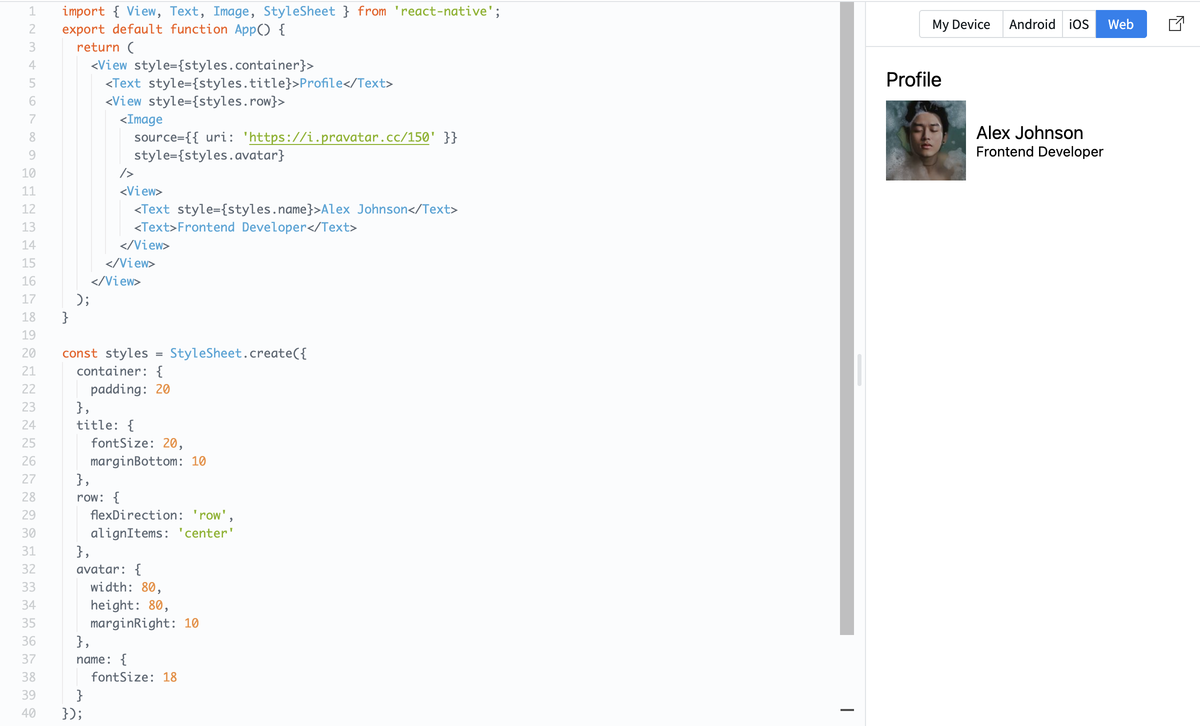
Here, flexDirection: 'row' places items side by side, and alignItems: 'center' aligns them vertically.
Flexbox is essential because it controls how your layout looks on different screen sizes.
Merci pour vos commentaires !
Demandez à l'IA

Demandez à l'IA

Posez n'importe quelle question ou essayez l'une des questions suggérées pour commencer notre discussion
Layout with Flexbox
React Native uses Flexbox to control layout.
Flexbox helps you position elements on the screen.
The most important properties are:
flexDirection: layout direction;justifyContent: alignment on the main axis;alignItems: alignment on the cross axis.
Example:
import { View, Text, Image, StyleSheet } from 'react-native';

export default function App() {
  return (
    <View style={styles.container}>
      <Text style={styles.title}>Profile</Text>

      <View style={styles.row}>
        <Image
          source={{ uri: 'https://i.pravatar.cc/150' }}
          style={styles.avatar}
        />

        <View>
          <Text style={styles.name}>Alex Johnson</Text>
          <Text>Frontend Developer</Text>
        </View>
      </View>
    </View>
  );
}

const styles = StyleSheet.create({
  container: {
    padding: 20
  },
  title: {
    fontSize: 20,
    marginBottom: 10
  },
  row: {
    flexDirection: 'row',
    alignItems: 'center'
  },
  avatar: {
    width: 80,
    height: 80,
    marginRight: 10
  },
  name: {
    fontSize: 18
  }
});
Here, flexDirection: 'row' places items side by side, and alignItems: 'center' aligns them vertically.
Flexbox is essential because it controls how your layout looks on different screen sizes.
Merci pour vos commentaires !
