セクション 2. 章 1
single
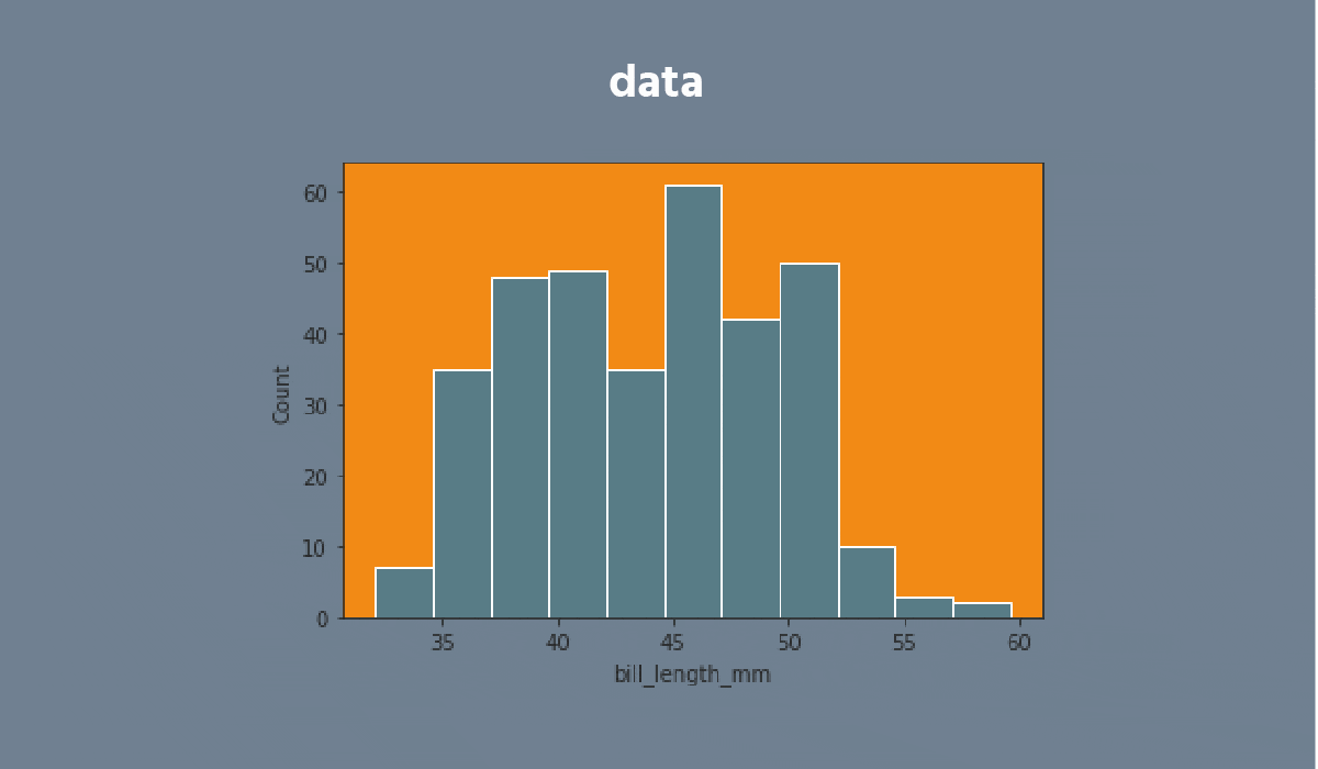
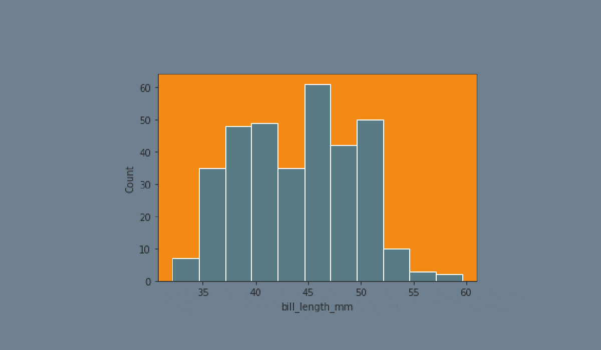
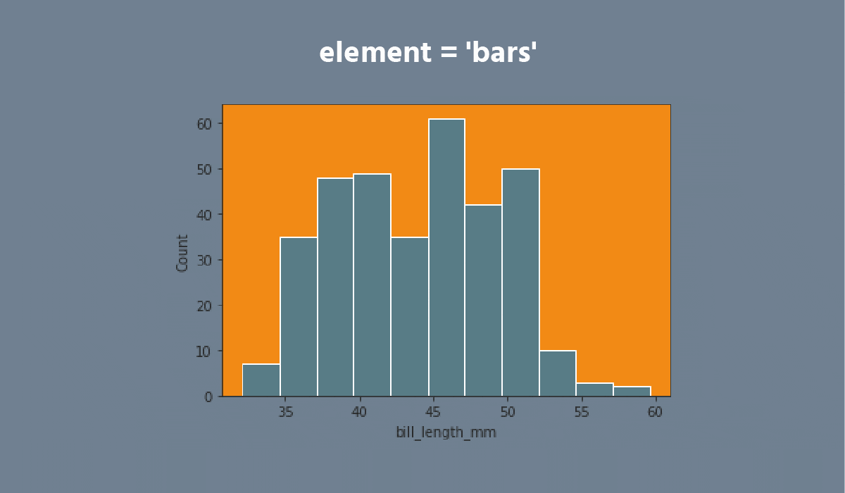
Histplot
メニューを表示するにはスワイプしてください
The distributions module contains several functions designed to answer questions such as these. The axes-level functions are histplot, kdeplot, ecdfplot, and rugplot. They are grouped together within the figure-level displot function.
A histplot is a classic visualization tool that represents the distribution of one or more variables by counting the number of observations that fall within discrete bins.
Click the slider to view possible arguments for the plot!


Don't forget to return back after exploring the dataset!
Note
Use
plt.show()to display the plot.
タスク
スワイプしてコーディングを開始
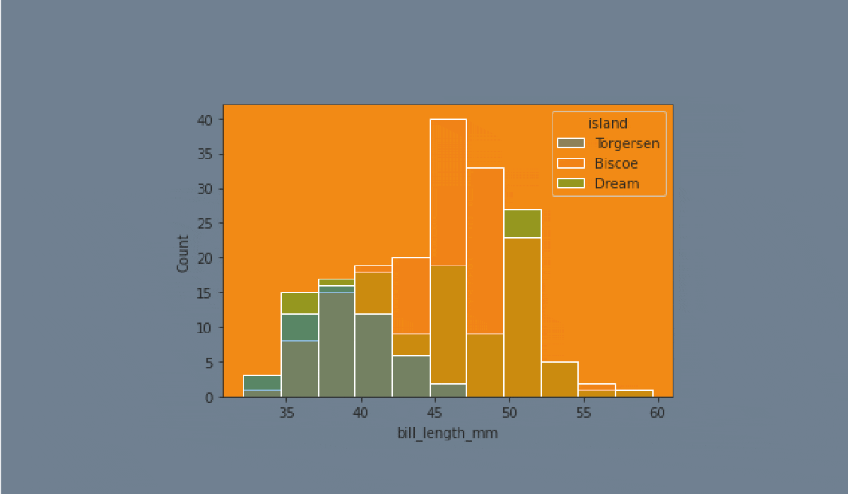
- Create the histplot using the
seabornlibrary:
- Set the
xparameter equals the'bill_length_mm'; - Set the
hueparameter equals the'island'; - Set the
elementparameter equals the'step'; - Set the
statparameter equals the'density'; - Set the
binwidthparameter equals1; - Set the
'flare'palette; - Use the
dfdata for the plot; - Display the plot.
解答
すべて明確でしたか?
フィードバックありがとうございます!
セクション 2. 章 1
single
AIに質問する
AIに質問する

何でも質問するか、提案された質問の1つを試してチャットを始めてください
