セクション 2. 章 2
single
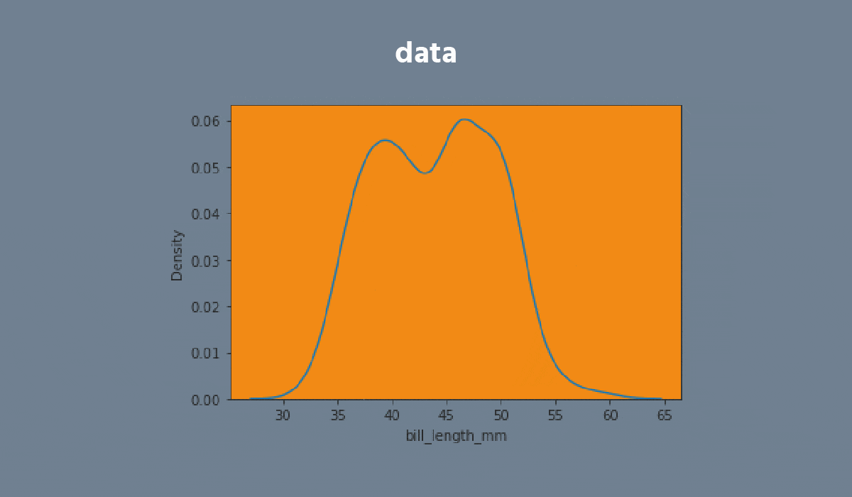
Kdeplot
メニューを表示するにはスワイプしてください
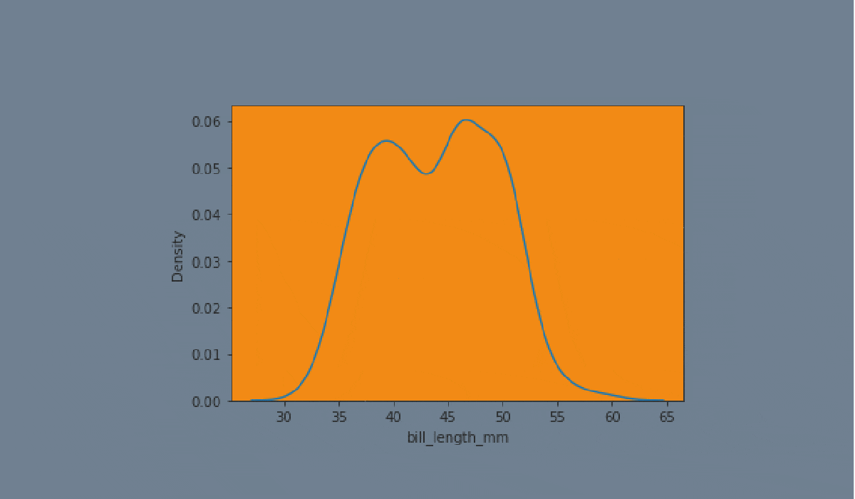
A kdeplot plot is a method for visualizing the distribution of observations in a dataset analogous to a histogram. KDE represents the data using a continuous probability density curve in one or more dimensions.


タスク
スワイプしてコーディングを開始
- Create the kdeplot using the
seabornlibrary:
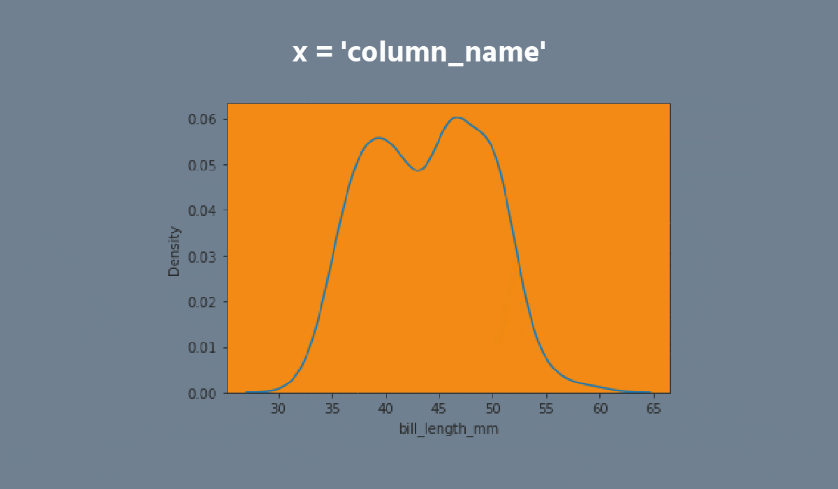
- Set the
xparameter equals the'max_temp'; - Set the
hueparameter equals the'month'; - Set the
multipleparameter equals the'stack'; - Disable the
legend; - Add the filling;
- Set the data;
- Display the plot.
解答
すべて明確でしたか?
フィードバックありがとうございます!
セクション 2. 章 2
single
AIに質問する
AIに質問する

何でも質問するか、提案された質問の1つを試してチャットを始めてください
