Notice: This page requires JavaScript to function properly.
Please enable JavaScript in your browser settings or update your browser.
Lære Building a Card Component | Section
Styling and Layout in React Native Apps

Building a Card Component

Sveip for å vise menyen

Now you will build your first reusable UI element — a card.

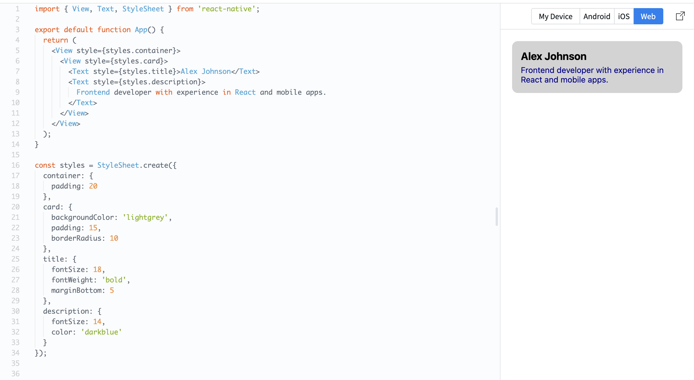
A card is a container that groups related content together. It usually has spacing, a background, and structured text.

Example:

import { View, Text, StyleSheet } from 'react-native';

export default function App() {
  return (
    <View style={styles.container}>
      <View style={styles.card}>
        <Text style={styles.title}>Alex Johnson</Text>
        <Text style={styles.description}>
          Frontend developer with experience in React and mobile apps.
        </Text>
      </View>
    </View>
  );
}

const styles = StyleSheet.create({
  container: {
    padding: 20
  },
  card: {
    backgroundColor: 'lightgrey',
    padding: 15,
    borderRadius: 10
  },
  title: {
    fontSize: 18,
    fontWeight: 'bold',
    marginBottom: 5
  },
  description: {
    fontSize: 14,
    color: 'darkblue'
  }
});

Here:

  • The card uses padding to create space inside;
  • Text is structured into title and description;
  • Rounded corners (borderRadius) make it look cleaner.

Cards are widely used in real apps because they help organize content into clear sections.
question mark

What is the purpose of a card component?

Velg det helt riktige svaret

Alt var klart?

Hvordan kan vi forbedre det?

Takk for tilbakemeldingene dine!

Seksjon 1. Kapittel 5

Spør AI

expand

Spør AI

ChatGPT

Spør om hva du vil, eller prøv ett av de foreslåtte spørsmålene for å starte chatten vår

Building a Card Component

Now you will build your first reusable UI element — a card.

A card is a container that groups related content together. It usually has spacing, a background, and structured text.

Example:

import { View, Text, StyleSheet } from 'react-native';

export default function App() {
  return (
    <View style={styles.container}>
      <View style={styles.card}>
        <Text style={styles.title}>Alex Johnson</Text>
        <Text style={styles.description}>
          Frontend developer with experience in React and mobile apps.
        </Text>
      </View>
    </View>
  );
}

const styles = StyleSheet.create({
  container: {
    padding: 20
  },
  card: {
    backgroundColor: 'lightgrey',
    padding: 15,
    borderRadius: 10
  },
  title: {
    fontSize: 18,
    fontWeight: 'bold',
    marginBottom: 5
  },
  description: {
    fontSize: 14,
    color: 'darkblue'
  }
});

Here:

  • The card uses padding to create space inside;
  • Text is structured into title and description;
  • Rounded corners (borderRadius) make it look cleaner.

Cards are widely used in real apps because they help organize content into clear sections.

Alt var klart?

Hvordan kan vi forbedre det?

Takk for tilbakemeldingene dine!

Seksjon 1. Kapittel 5
some-alt