Varmekart
Et varmekart er en metode for å visualisere todimensjonale data ved å bruke farger for å representere størrelsen på hver verdi.
Dette eksempelet bruker et varmekart for å visualisere parvise korrelasjoner mellom variabler.
Lage et enkelt varmekart
seaborn.heatmap() tar et todimensjonalt datasett. Et vanlig bruksområde er å plotte en korrelasjonsmatrise: gitt en DataFrame, bruk .corr() for å beregne korrelasjoner, og send deretter den resulterende matrisen til heatmap().
1234567891011import seaborn as sns import matplotlib.pyplot as plt import pandas as pd url = 'https://content-media-cdn.codefinity.com/courses/47339f29-4722-4e72-a0d4-6112c70ff738/countries_data.csv' countries_df = pd.read_csv(url, index_col=0) correlation_matrix = countries_df.corr(numeric_only=True) sns.heatmap(correlation_matrix) plt.show()
Korrelasjonsmatrisen opprettes kun fra numeriske kolonner (numeric_only=True).
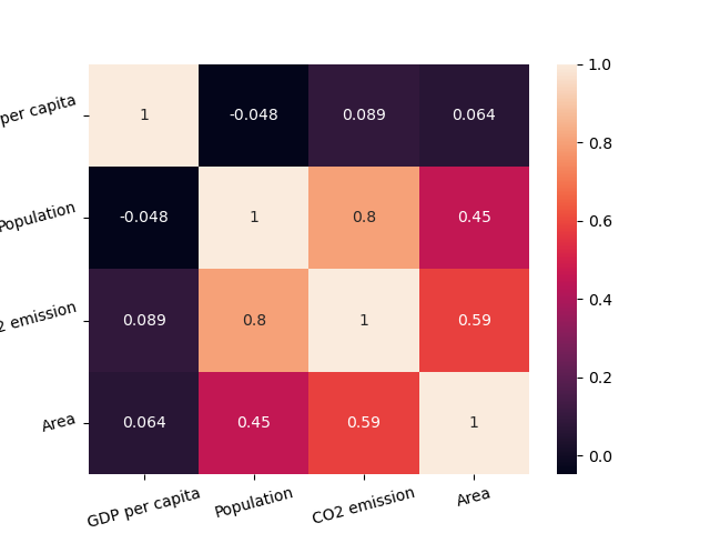
Annotasjon og farger
Ved å sette annot=True vises korrelasjonsverdiene inne i hver celle. Vi kan også velge et fargekart ved å bruke cmap.
Det er også mulig å endre fargene for varmekartet ved å sette parameteren cmap (du kan utforske dette i "Choosing color palettes"-artikkelen).
1234567891011import seaborn as sns import matplotlib.pyplot as plt import pandas as pd url = 'https://content-media-cdn.codefinity.com/courses/47339f29-4722-4e72-a0d4-6112c70ff738/countries_data.csv' countries_df = pd.read_csv(url, index_col=0) correlation_matrix = countries_df.corr(numeric_only=True) sns.heatmap(correlation_matrix, annot=True, cmap='viridis') plt.show()
Fargelinjen til høyre kan fjernes ved å sette cbar=False.
I de fleste tilfeller er dette alt du trenger for tilpasning av varmekart, men du kan alltid utforske mer i heatmap() dokumentasjonen.
Forbedre lesbarhet
Det siste som vil forbedre lesbarheten til varmekartet vårt er å rotere merkene ved å bruke de allerede kjente funksjonene xticks() og yticks():
1234567891011121314import seaborn as sns import matplotlib.pyplot as plt import pandas as pd url = 'https://content-media-cdn.codefinity.com/courses/47339f29-4722-4e72-a0d4-6112c70ff738/countries_data.csv' countries_df = pd.read_csv(url, index_col=0) correlation_matrix = countries_df.corr(numeric_only=True) sns.heatmap(correlation_matrix, annot=True, cmap='viridis') plt.xticks(rotation=20) plt.yticks(rotation=20) plt.show()
Takk for tilbakemeldingene dine!
single
Varmekart
Sveip for å vise menyen
Et varmekart er en metode for å visualisere todimensjonale data ved å bruke farger for å representere størrelsen på hver verdi.
Dette eksempelet bruker et varmekart for å visualisere parvise korrelasjoner mellom variabler.
Lage et enkelt varmekart
seaborn.heatmap() tar et todimensjonalt datasett. Et vanlig bruksområde er å plotte en korrelasjonsmatrise: gitt en DataFrame, bruk .corr() for å beregne korrelasjoner, og send deretter den resulterende matrisen til heatmap().
1234567891011import seaborn as sns import matplotlib.pyplot as plt import pandas as pd url = 'https://content-media-cdn.codefinity.com/courses/47339f29-4722-4e72-a0d4-6112c70ff738/countries_data.csv' countries_df = pd.read_csv(url, index_col=0) correlation_matrix = countries_df.corr(numeric_only=True) sns.heatmap(correlation_matrix) plt.show()
Korrelasjonsmatrisen opprettes kun fra numeriske kolonner (numeric_only=True).
Annotasjon og farger
Ved å sette annot=True vises korrelasjonsverdiene inne i hver celle. Vi kan også velge et fargekart ved å bruke cmap.
Det er også mulig å endre fargene for varmekartet ved å sette parameteren cmap (du kan utforske dette i "Choosing color palettes"-artikkelen).
1234567891011import seaborn as sns import matplotlib.pyplot as plt import pandas as pd url = 'https://content-media-cdn.codefinity.com/courses/47339f29-4722-4e72-a0d4-6112c70ff738/countries_data.csv' countries_df = pd.read_csv(url, index_col=0) correlation_matrix = countries_df.corr(numeric_only=True) sns.heatmap(correlation_matrix, annot=True, cmap='viridis') plt.show()
Fargelinjen til høyre kan fjernes ved å sette cbar=False.
I de fleste tilfeller er dette alt du trenger for tilpasning av varmekart, men du kan alltid utforske mer i heatmap() dokumentasjonen.
Forbedre lesbarhet
Det siste som vil forbedre lesbarheten til varmekartet vårt er å rotere merkene ved å bruke de allerede kjente funksjonene xticks() og yticks():
1234567891011121314import seaborn as sns import matplotlib.pyplot as plt import pandas as pd url = 'https://content-media-cdn.codefinity.com/courses/47339f29-4722-4e72-a0d4-6112c70ff738/countries_data.csv' countries_df = pd.read_csv(url, index_col=0) correlation_matrix = countries_df.corr(numeric_only=True) sns.heatmap(correlation_matrix, annot=True, cmap='viridis') plt.xticks(rotation=20) plt.yticks(rotation=20) plt.show()
Sveip for å begynne å kode
- Bruk riktig metode for å lage en korrelasjonsmatrise.
- Sett argumentet til metoden slik at kun numeriske variabler inkluderes.
- Bruk riktig funksjon for å lage et varmekart.
- Sett
correlation_matrixsom data for varmekartet ved å spesifisere det som første argument. - Legg til verdiene i hver celle i matrisen ved å spesifisere det som andre argument.
- Sett paletten (fargekartet) til varmekartet til
'crest'ved å spesifisere det som tredje (høyre) argument. - Roter x- og y-aksens etiketter 15 grader mot klokken ved å spesifisere et nøkkelordargument i
xticks()ogyticks().
Løsning
Takk for tilbakemeldingene dine!
single
Spør AI
Spør AI

Spør om hva du vil, eller prøv ett av de foreslåtte spørsmålene for å starte chatten vår
