single
KDE-Plot
Sveip for å vise menyen
Et Kernel Density Estimation (KDE)-plott er en type plott som visualiserer den estimerte sannsynlighetstetthetsfunksjonen til en kontinuerlig variabel. I motsetning til et histogram, som viser data ved hjelp av diskrete stolper gruppert i intervaller, representerer et KDE-plott fordelingen som en jevn, kontinuerlig kurve basert på alle datapunktene.
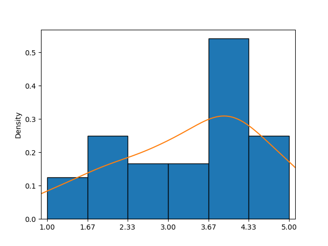
Dette eksempelet viser et histogram kombinert med et KDE-plott (oransje kurve), som gir en tydeligere tilnærming til sannsynlighetstetthetsfunksjonen enn histogrammet alene.
I seaborn gjør funksjonen kdeplot() det enkelt å lage KDE-plott. De viktigste parameterne—data, x og y—fungerer på samme måte som i countplot().
Første alternativ
Kun én av parameterne kan settes ved å sende en sekvens av verdier, noe som gir individuell tilpasning for hvert element.
123456789101112import pandas as pd import matplotlib.pyplot as plt import seaborn as sns # Loading the dataset with the average yearly temperatures in Boston and Seattle url = 'https://content-media-cdn.codefinity.com/courses/47339f29-4722-4e72-a0d4-6112c70ff738/weather_data.csv' weather_df = pd.read_csv(url, index_col=0) # Creating a KDE plot setting only the data parameter sns.kdeplot(data=weather_df['Seattle'], fill=True) plt.show()
Parameteren data settes ved å sende et Series-objekt, og parameteren fill brukes for å fylle området under kurven, som som standard ikke er fylt.
Andre alternativ
Det er også mulig å angi et 2D-objekt som en DataFrame for data og et kolonnenavn eller en nøkkel hvis data er en ordbok for x (vertikal orientering) eller y (horisontal orientering):
123456789101112import pandas as pd import matplotlib.pyplot as plt import seaborn as sns # Loading the dataset with the average yearly temperatures in Boston and Seattle url = 'https://content-media-cdn.codefinity.com/courses/47339f29-4722-4e72-a0d4-6112c70ff738/weather_data.csv' weather_df = pd.read_csv(url, index_col=0) # Creating a KDE plot setting both the data and x parameters sns.kdeplot(data=weather_df, x='Seattle', fill=True) plt.show()
De samme resultatene ble oppnådd ved å sende hele DataFrame som data-parameteren og spesifisere kolonnenavnet for x-parameteren.
KDE-plottet som er opprettet viser en karakteristisk klokkeformet kurve, som ligner en normalfordeling med et gjennomsnitt rundt 52°F.
Dersom du ønsker å utforske mer om KDE plot-funksjonen, kan du lese mer i kdeplot() dokumentasjonen.
Sveip for å begynne å kode
- Bruk riktig funksjon for å lage et KDE-diagram.
- Bruk
countries_dfsom data for diagrammet (første argument). - Angi
'GDP per capita'som kolonnen som skal brukes og orienteringen til horisontal via det andre argumentet. - Fyll området under kurven via det tredje (høyre) argumentet.
Løsning
Takk for tilbakemeldingene dine!
single
Spør AI
Spør AI

Spør om hva du vil, eller prøv ett av de foreslåtte spørsmålene for å starte chatten vår
