Heatmap
Een heatmap is een methode voor het visualiseren van tweedimensionale gegevens waarbij kleuren worden gebruikt om de grootte van elke waarde weer te geven.
Dit voorbeeld gebruikt een heatmap om pairwise correlaties tussen variabelen te visualiseren.
Een eenvoudige heatmap maken
seaborn.heatmap() gebruikt een 2D-dataset. Een veelvoorkomend gebruik is het plotten van een correlatiematrix: geef een DataFrame, roep .corr() aan om correlaties te berekenen en geef vervolgens de resulterende matrix door aan heatmap().
1234567891011import seaborn as sns import matplotlib.pyplot as plt import pandas as pd url = 'https://content-media-cdn.codefinity.com/courses/47339f29-4722-4e72-a0d4-6112c70ff738/countries_data.csv' countries_df = pd.read_csv(url, index_col=0) correlation_matrix = countries_df.corr(numeric_only=True) sns.heatmap(correlation_matrix) plt.show()
De correlatiematrix wordt alleen gemaakt van numerieke kolommen (numeric_only=True).
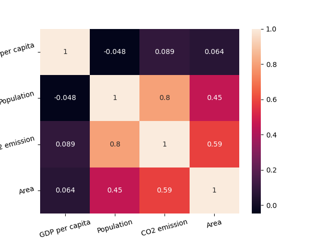
Annotaties en Kleuren
Door annot=True in te stellen, worden de correlatiewaarden in elke cel weergegeven. We kunnen ook een kleurenschema kiezen met behulp van cmap.
Het is ook mogelijk om de kleuren van onze heatmap aan te passen door de parameter cmap in te stellen (je kunt dit verder verkennen in het "Kleurpaletten kiezen" artikel).
1234567891011import seaborn as sns import matplotlib.pyplot as plt import pandas as pd url = 'https://content-media-cdn.codefinity.com/courses/47339f29-4722-4e72-a0d4-6112c70ff738/countries_data.csv' countries_df = pd.read_csv(url, index_col=0) correlation_matrix = countries_df.corr(numeric_only=True) sns.heatmap(correlation_matrix, annot=True, cmap='viridis') plt.show()
De kleurstaaf aan de rechterkant kan worden verwijderd door cbar=False in te stellen.
In de meeste gevallen is dit alles wat nodig is voor een heatmap-aanpassing, maar je kunt altijd meer ontdekken in de heatmap()-documentatie.
Leesbaarheid Verbeteren
Het laatste wat de leesbaarheid van onze heatmap zou verbeteren, is het roteren van de ticks met behulp van de reeds bekende functies xticks() en yticks():
1234567891011121314import seaborn as sns import matplotlib.pyplot as plt import pandas as pd url = 'https://content-media-cdn.codefinity.com/courses/47339f29-4722-4e72-a0d4-6112c70ff738/countries_data.csv' countries_df = pd.read_csv(url, index_col=0) correlation_matrix = countries_df.corr(numeric_only=True) sns.heatmap(correlation_matrix, annot=True, cmap='viridis') plt.xticks(rotation=20) plt.yticks(rotation=20) plt.show()
Bedankt voor je feedback!
single
Heatmap
Veeg om het menu te tonen
Een heatmap is een methode voor het visualiseren van tweedimensionale gegevens waarbij kleuren worden gebruikt om de grootte van elke waarde weer te geven.
Dit voorbeeld gebruikt een heatmap om pairwise correlaties tussen variabelen te visualiseren.
Een eenvoudige heatmap maken
seaborn.heatmap() gebruikt een 2D-dataset. Een veelvoorkomend gebruik is het plotten van een correlatiematrix: geef een DataFrame, roep .corr() aan om correlaties te berekenen en geef vervolgens de resulterende matrix door aan heatmap().
1234567891011import seaborn as sns import matplotlib.pyplot as plt import pandas as pd url = 'https://content-media-cdn.codefinity.com/courses/47339f29-4722-4e72-a0d4-6112c70ff738/countries_data.csv' countries_df = pd.read_csv(url, index_col=0) correlation_matrix = countries_df.corr(numeric_only=True) sns.heatmap(correlation_matrix) plt.show()
De correlatiematrix wordt alleen gemaakt van numerieke kolommen (numeric_only=True).
Annotaties en Kleuren
Door annot=True in te stellen, worden de correlatiewaarden in elke cel weergegeven. We kunnen ook een kleurenschema kiezen met behulp van cmap.
Het is ook mogelijk om de kleuren van onze heatmap aan te passen door de parameter cmap in te stellen (je kunt dit verder verkennen in het "Kleurpaletten kiezen" artikel).
1234567891011import seaborn as sns import matplotlib.pyplot as plt import pandas as pd url = 'https://content-media-cdn.codefinity.com/courses/47339f29-4722-4e72-a0d4-6112c70ff738/countries_data.csv' countries_df = pd.read_csv(url, index_col=0) correlation_matrix = countries_df.corr(numeric_only=True) sns.heatmap(correlation_matrix, annot=True, cmap='viridis') plt.show()
De kleurstaaf aan de rechterkant kan worden verwijderd door cbar=False in te stellen.
In de meeste gevallen is dit alles wat nodig is voor een heatmap-aanpassing, maar je kunt altijd meer ontdekken in de heatmap()-documentatie.
Leesbaarheid Verbeteren
Het laatste wat de leesbaarheid van onze heatmap zou verbeteren, is het roteren van de ticks met behulp van de reeds bekende functies xticks() en yticks():
1234567891011121314import seaborn as sns import matplotlib.pyplot as plt import pandas as pd url = 'https://content-media-cdn.codefinity.com/courses/47339f29-4722-4e72-a0d4-6112c70ff738/countries_data.csv' countries_df = pd.read_csv(url, index_col=0) correlation_matrix = countries_df.corr(numeric_only=True) sns.heatmap(correlation_matrix, annot=True, cmap='viridis') plt.xticks(rotation=20) plt.yticks(rotation=20) plt.show()
Veeg om te beginnen met coderen
- Gebruik de juiste methode om een correlatiematrix te maken.
- Stel het argument van de methode zo in dat alleen numerieke variabelen worden meegenomen.
- Gebruik de juiste functie om een heatmap te maken.
- Stel
correlation_matrixin als de data voor de heatmap door deze als eerste argument te specificeren. - Voeg de waarden in elke cel van de matrix toe door het tweede argument te specificeren.
- Stel het palet (kleurenschema) van de heatmap in op
'crest'door het derde (meest rechtse) argument te specificeren. - Draai de x-as- en y-as-ticks 15 graden tegen de klok in door een keyword-argument in
xticks()enyticks()te specificeren.
Oplossing
Bedankt voor je feedback!
single
Vraag AI
Vraag AI

Vraag wat u wilt of probeer een van de voorgestelde vragen om onze chat te starten.
