Sectie 3. Hoofdstuk 5
single
Barplot
Veeg om het menu te tonen
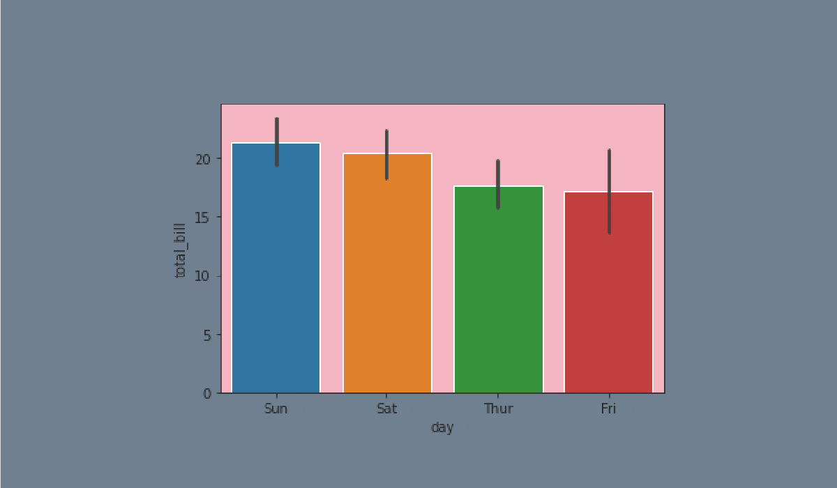
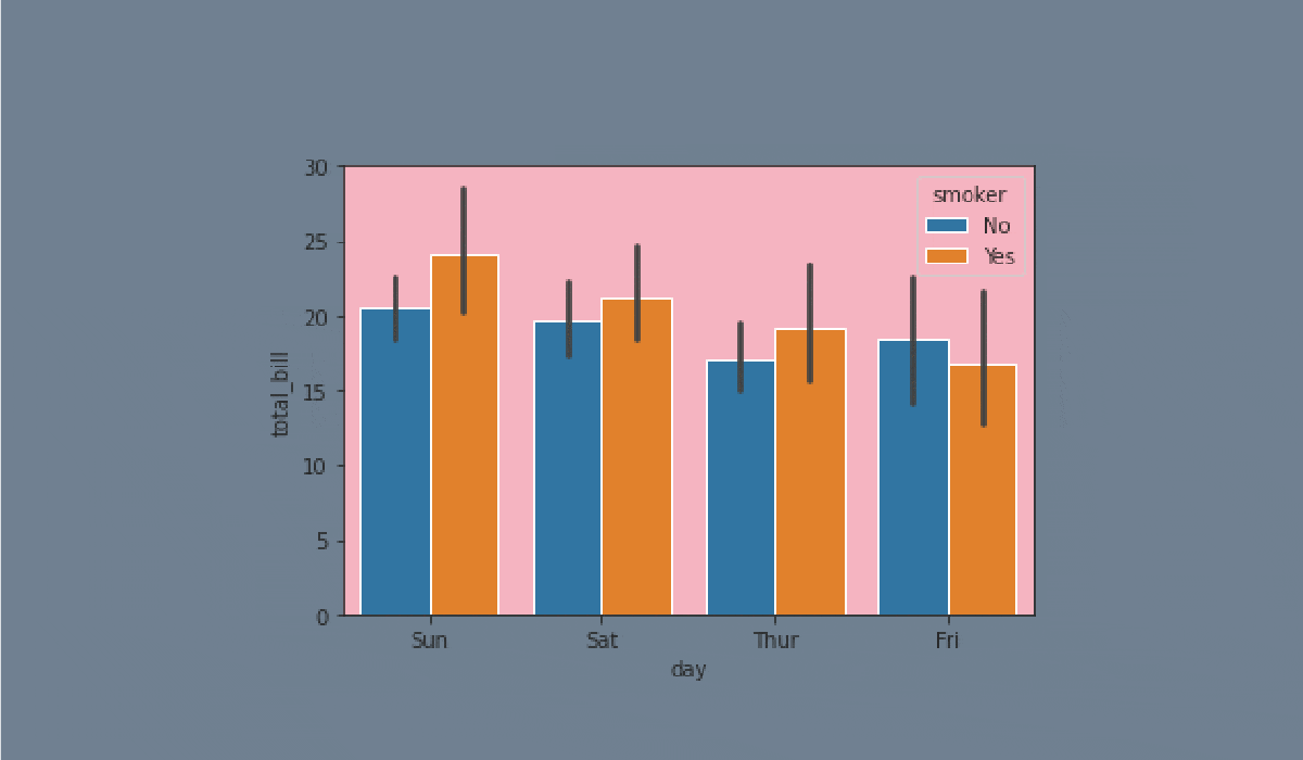
A barplot represents an estimate of the central tendency for a numeric variable with the height of each rectangle and provides some indication of the uncertainty around that estimate using error bars.
Bar plots include 0 in the quantitative axis range, and they are a good choice when 0 is a meaningful value for the quantitative variable, and you want to make comparisons against it.


Taak
Veeg om te beginnen met coderen
- Set the
'ticks'style. - Create the
barplotusing theseabornlibrary:
- Set the
xparameter equals the'day'; - Set the
yparameter equals the'total_bill'; - Set the
hueparameter equals the'smoker'; - Set the
linewidthparameter equals2.5; - Set the
capsizeparameter equals0.1; - Set the
'pink'errcolorparameter; - Set the
'magma'palette; - Set the data;
- Display the plot.
Oplossing
Was alles duidelijk?
Bedankt voor je feedback!
Sectie 3. Hoofdstuk 5
single
Vraag AI
Vraag AI

Vraag wat u wilt of probeer een van de voorgestelde vragen om onze chat te starten.
