single
Heatmap
Deslize para mostrar o menu
A heatmap is a method for visualizing two-dimensional data using colors to represent the magnitude of each value.
This example uses a heatmap to visualize pairwise correlations between variables.
Creating a Simple Heatmap
seaborn.heatmap() takes a 2D dataset. A common use case is plotting a correlation matrix: given a DataFrame, call .corr() to compute correlations, then pass the resulting matrix to heatmap().
1234567891011import seaborn as sns import matplotlib.pyplot as plt import pandas as pd url = 'https://content-media-cdn.codefinity.com/courses/47339f29-4722-4e72-a0d4-6112c70ff738/countries_data.csv' countries_df = pd.read_csv(url, index_col=0) correlation_matrix = countries_df.corr(numeric_only=True) sns.heatmap(correlation_matrix) plt.show()
The correlation matrix is created from numeric columns only (numeric_only=True).
Annotation and Colors
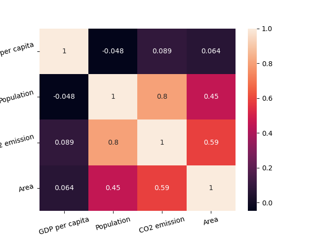
Setting annot=True writes the correlation values inside each cell. We can also pick a colormap using cmap.
It is also possible to change the colors for our heatmap via setting the cmap parameter (you can explore it in the "Choosing color palettes" article).
1234567891011import seaborn as sns import matplotlib.pyplot as plt import pandas as pd url = 'https://content-media-cdn.codefinity.com/courses/47339f29-4722-4e72-a0d4-6112c70ff738/countries_data.csv' countries_df = pd.read_csv(url, index_col=0) correlation_matrix = countries_df.corr(numeric_only=True) sns.heatmap(correlation_matrix, annot=True, cmap='viridis') plt.show()
The color bar on the right can be removed by setting cbar=False.
In most of the cases that's all you will need from a heatmap customization, however, you can always explore more in heatmap() documentation.
Improving Readability
The final thing that would improve the readability of our heatmap is rotating the ticks using already familiar xticks() and yticks() functions:
1234567891011121314import seaborn as sns import matplotlib.pyplot as plt import pandas as pd url = 'https://content-media-cdn.codefinity.com/courses/47339f29-4722-4e72-a0d4-6112c70ff738/countries_data.csv' countries_df = pd.read_csv(url, index_col=0) correlation_matrix = countries_df.corr(numeric_only=True) sns.heatmap(correlation_matrix, annot=True, cmap='viridis') plt.xticks(rotation=20) plt.yticks(rotation=20) plt.show()
Deslize para começar a programar
- Use the correct method to create a correlation matrix.
- Set the argument of the method to include only numeric variables.
- Use the correct function to create a heatmap.
- Set
correlation_matrixto be the data for the heatmap via specifying the first argument. - Add the values in each cell of the matrix via specifying the second argument.
- Set the palette (color map) of the heatmap to
'crest'via specifying the third (rightmost) argument. - Rotate x-axis and y-axis ticks by 15 degrees counterclockwise via specifying a keyword argument in
xticks()andyticks().
Solução
Obrigado pelo seu feedback!
single
Pergunte à IA
Pergunte à IA

Pergunte o que quiser ou experimente uma das perguntas sugeridas para iniciar nosso bate-papo
