single
Cirkeldiagram
Svep för att visa menyn
Cirkeldiagram är ett diagram som använder en cirkel uppdelad i skivor (segment) för att representera den numeriska andelen (procentuell fördelning) av nominella data.
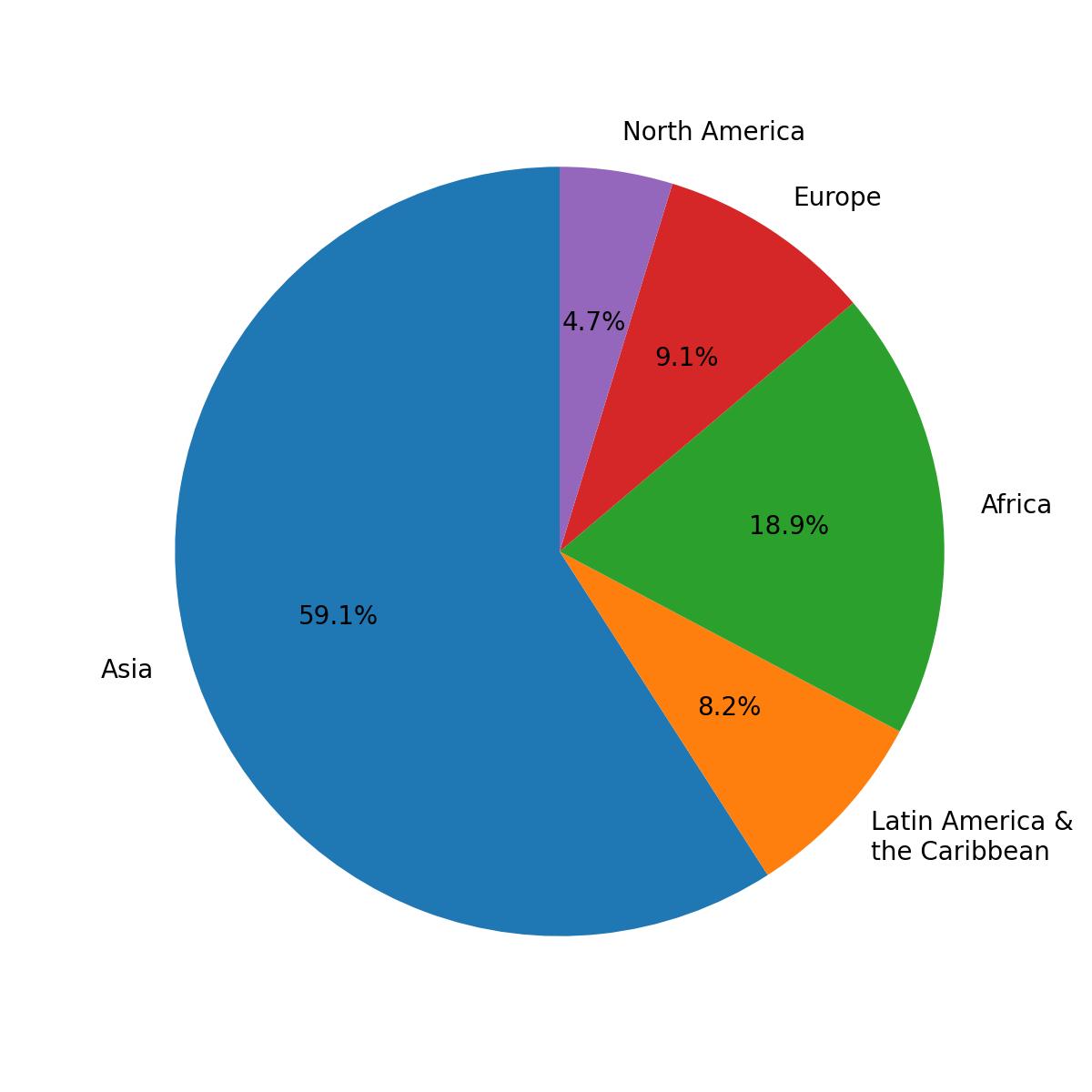
Detta diagram visar den procentuella fördelningen av befolkningen per region.
Trots att cirkeldiagram är snygga bör de oftast undvikas, eftersom de förvränger datavisningen. En kategori med många förekomster kommer att verka ännu större, en kategori med få förekomster kommer att verka ännu mindre.
Cirkeldiagram med etiketter
Använd funktionen pie() från modulen pyplot för att skapa ett cirkeldiagram. Dess enda obligatoriska parameter är data (x).
Parametern labels tilldelar etiketter till varje segment och ska vara en sekvens av strängar.
123456import pandas as pd url = 'https://content-media-cdn.codefinity.com/courses/47339f29-4722-4e72-a0d4-6112c70ff738/population.csv' population_df = pd.read_csv(url) print(population_df)
Denna DataFrame innehåller befolkningen för varje region.
123456import matplotlib.pyplot as plt import pandas as pd population_df = pd.read_csv('https://content-media-cdn.codefinity.com/courses/47339f29-4722-4e72-a0d4-6112c70ff738/population.csv') # Creating a pie chart and setting the labels for each region plt.pie(population_df['Population'], labels=population_df['Region']) plt.show()
Funktionen pie() anropades med Series av befolkningsdata som skickades som x-parameter, och Series med regionnamn angavs som segmentetiketter med hjälp av parametern labels.
Lägga till procenttal
För att visa procentandelen för varje segment, använd parametern autopct i funktionen pie(). Denna parameter styr hur procenttalen formateras och visas i diagrammet.
Den accepterar antingen en formatsträng eller en funktion. Här fokuseras det på att använda en formatsträng.
123456789import matplotlib.pyplot as plt import pandas as pd population_df = pd.read_csv('https://content-media-cdn.codefinity.com/courses/47339f29-4722-4e72-a0d4-6112c70ff738/population.csv') # Setting the label for each region and its percentage plt.pie(population_df['Population'], labels=population_df['Region'], autopct='%1.1f%%') plt.show()
Formatsträng
Strängen %1.1f%% formaterar procentvärdena som visas i cirkeldiagrammet.
%finnebär att värdet är ett flyttal;.1anger en siffra efter decimaltecknet;- Dubbel
%säkerställer att procenttecknet visas i utdata.
Om du vill utforska fler parametrar finns här pie() dokumentation för dig.
Svep för att börja koda
- Använd rätt funktion för att skapa ett cirkeldiagram.
- Använd
incomessom data för cirkeldiagrammet (det första argumentet). - Ange etiketterna till
namesvia det andra argumentet. - Ange formatet för procenttalet till ett flyttal med en decimal via det tredje argumentet.
Lösning
Tack för dina kommentarer!
single
Fråga AI
Fråga AI

Fråga vad du vill eller prova någon av de föreslagna frågorna för att starta vårt samtal
