single
Теплова Карта
Свайпніть щоб показати меню
Теплова карта — це метод візуалізації двовимірних даних за допомогою кольорів, які відображають величину кожного значення.
У цьому прикладі теплова карта використовується для візуалізації парних кореляцій між змінними.
Створення простої теплової карти
seaborn.heatmap() приймає двовимірний набір даних. Поширений випадок використання — побудова матриці кореляцій: для заданого DataFrame викликається .corr() для обчислення кореляцій, після чого отриману матрицю передають у heatmap().
1234567891011import seaborn as sns import matplotlib.pyplot as plt import pandas as pd url = 'https://content-media-cdn.codefinity.com/courses/47339f29-4722-4e72-a0d4-6112c70ff738/countries_data.csv' countries_df = pd.read_csv(url, index_col=0) correlation_matrix = countries_df.corr(numeric_only=True) sns.heatmap(correlation_matrix) plt.show()
Матриця кореляцій створюється лише з числових стовпців (numeric_only=True).
Анотації та кольори
Встановлення annot=True дозволяє відображати значення кореляції всередині кожної комірки. Також можна вибрати кольорову палітру за допомогою параметра cmap.
Також можливо змінити кольори для нашої теплової карти, встановивши параметр cmap (можна ознайомитися з палітрами у статті "Вибір палітр кольорів").
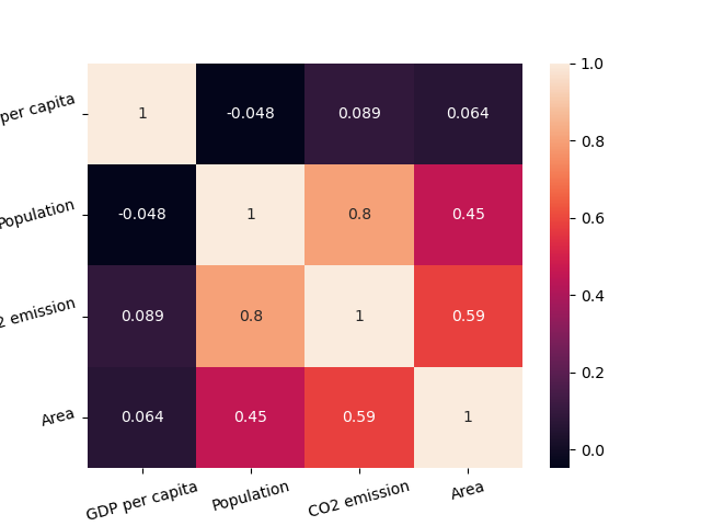
1234567891011import seaborn as sns import matplotlib.pyplot as plt import pandas as pd url = 'https://content-media-cdn.codefinity.com/courses/47339f29-4722-4e72-a0d4-6112c70ff738/countries_data.csv' countries_df = pd.read_csv(url, index_col=0) correlation_matrix = countries_df.corr(numeric_only=True) sns.heatmap(correlation_matrix, annot=True, cmap='viridis') plt.show()
Колірна шкала праворуч може бути видалена шляхом встановлення параметра cbar=False.
У більшості випадків цього достатньо для налаштування теплової карти, однак завжди можна дослідити більше у heatmap() документації.
Покращення читабельності
Останнє, що покращить читабельність нашої теплової карти — це обертання підписів за допомогою вже знайомих функцій xticks() та yticks():
1234567891011121314import seaborn as sns import matplotlib.pyplot as plt import pandas as pd url = 'https://content-media-cdn.codefinity.com/courses/47339f29-4722-4e72-a0d4-6112c70ff738/countries_data.csv' countries_df = pd.read_csv(url, index_col=0) correlation_matrix = countries_df.corr(numeric_only=True) sns.heatmap(correlation_matrix, annot=True, cmap='viridis') plt.xticks(rotation=20) plt.yticks(rotation=20) plt.show()
Проведіть, щоб почати кодувати
- Використання коректного методу для створення матриці кореляції.
- Встановлення аргументу методу для включення лише числових змінних.
- Використання відповідної функції для створення теплової карти.
- Встановлення
correlation_matrixяк даних для теплової карти шляхом зазначення першого аргументу. - Додавання значень у кожну клітинку матриці шляхом зазначення другого аргументу.
- Встановлення палітри (кольорової карти) теплової карти на
'crest'шляхом зазначення третього (правого) аргументу. - Обертання підписів осі x та осі y на 15 градусів проти годинникової стрілки шляхом зазначення іменованого аргументу у функціях
xticks()таyticks().
Рішення
Дякуємо за ваш відгук!
single
Запитати АІ
Запитати АІ

Запитайте про що завгодно або спробуйте одне із запропонованих запитань, щоб почати наш чат
