Графік KDE
Оцінка щільності ядра (KDE-плот) — це тип графіка, який відображає оцінену функцію щільності ймовірності для неперервної змінної. На відміну від гістограми, яка показує дані у вигляді дискретних стовпчиків, згрупованих за інтервалами, KDE-плот представляє розподіл як плавну, неперервну криву, побудовану на основі всіх точок даних.
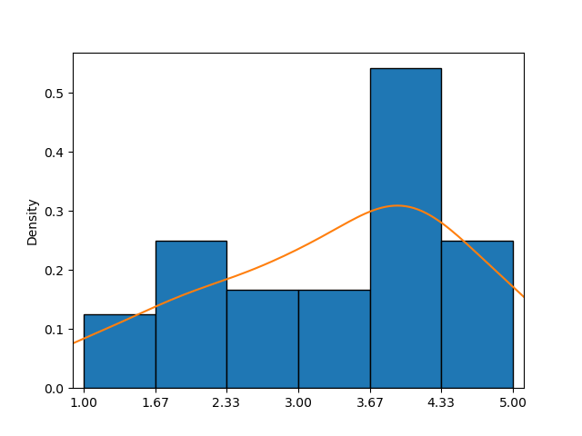
Цей приклад демонструє гістограму у поєднанні з KDE-плотом (помаранчева крива), що забезпечує більш точне наближення функції щільності ймовірності, ніж лише гістограма.
У seaborn функція kdeplot() дозволяє легко створювати KDE-плоти. Основні параметри — data, x та y — працюють так само, як і в countplot().
Перший варіант
Лише один із параметрів може бути заданий шляхом передачі послідовності значень, що дозволяє індивідуально налаштовувати кожен елемент.
123456789101112import pandas as pd import matplotlib.pyplot as plt import seaborn as sns # Loading the dataset with the average yearly temperatures in Boston and Seattle url = 'https://content-media-cdn.codefinity.com/courses/47339f29-4722-4e72-a0d4-6112c70ff738/weather_data.csv' weather_df = pd.read_csv(url, index_col=0) # Creating a KDE plot setting only the data parameter sns.kdeplot(data=weather_df['Seattle'], fill=True) plt.show()
Параметр data задається шляхом передачі об'єкта Series, а параметр fill використовується для заповнення області під кривою, яка за замовчуванням не заповнена.
Другий варіант
Можна також задати 2D-об'єкт, наприклад DataFrame, для параметра data та ім'я стовпця або ключ, якщо data є словником, для параметра x (вертикальна орієнтація) або y (горизонтальна орієнтація):
123456789101112import pandas as pd import matplotlib.pyplot as plt import seaborn as sns # Loading the dataset with the average yearly temperatures in Boston and Seattle url = 'https://content-media-cdn.codefinity.com/courses/47339f29-4722-4e72-a0d4-6112c70ff738/weather_data.csv' weather_df = pd.read_csv(url, index_col=0) # Creating a KDE plot setting both the data and x parameters sns.kdeplot(data=weather_df, x='Seattle', fill=True) plt.show()
Той самий результат досягається шляхом передачі всього DataFrame як параметра data та вказання імені стовпця для параметра x.
Побудований KDE-графік має характерну форму дзвону, що нагадує нормальний розподіл із середнім значенням близько 52°F.
Якщо бажаєте дізнатися більше про функцію KDE plot, зверніться до kdeplot() документації.
Дякуємо за ваш відгук!
single
Графік KDE
Свайпніть щоб показати меню
Оцінка щільності ядра (KDE-плот) — це тип графіка, який відображає оцінену функцію щільності ймовірності для неперервної змінної. На відміну від гістограми, яка показує дані у вигляді дискретних стовпчиків, згрупованих за інтервалами, KDE-плот представляє розподіл як плавну, неперервну криву, побудовану на основі всіх точок даних.
Цей приклад демонструє гістограму у поєднанні з KDE-плотом (помаранчева крива), що забезпечує більш точне наближення функції щільності ймовірності, ніж лише гістограма.
У seaborn функція kdeplot() дозволяє легко створювати KDE-плоти. Основні параметри — data, x та y — працюють так само, як і в countplot().
Перший варіант
Лише один із параметрів може бути заданий шляхом передачі послідовності значень, що дозволяє індивідуально налаштовувати кожен елемент.
123456789101112import pandas as pd import matplotlib.pyplot as plt import seaborn as sns # Loading the dataset with the average yearly temperatures in Boston and Seattle url = 'https://content-media-cdn.codefinity.com/courses/47339f29-4722-4e72-a0d4-6112c70ff738/weather_data.csv' weather_df = pd.read_csv(url, index_col=0) # Creating a KDE plot setting only the data parameter sns.kdeplot(data=weather_df['Seattle'], fill=True) plt.show()
Параметр data задається шляхом передачі об'єкта Series, а параметр fill використовується для заповнення області під кривою, яка за замовчуванням не заповнена.
Другий варіант
Можна також задати 2D-об'єкт, наприклад DataFrame, для параметра data та ім'я стовпця або ключ, якщо data є словником, для параметра x (вертикальна орієнтація) або y (горизонтальна орієнтація):
123456789101112import pandas as pd import matplotlib.pyplot as plt import seaborn as sns # Loading the dataset with the average yearly temperatures in Boston and Seattle url = 'https://content-media-cdn.codefinity.com/courses/47339f29-4722-4e72-a0d4-6112c70ff738/weather_data.csv' weather_df = pd.read_csv(url, index_col=0) # Creating a KDE plot setting both the data and x parameters sns.kdeplot(data=weather_df, x='Seattle', fill=True) plt.show()
Той самий результат досягається шляхом передачі всього DataFrame як параметра data та вказання імені стовпця для параметра x.
Побудований KDE-графік має характерну форму дзвону, що нагадує нормальний розподіл із середнім значенням близько 52°F.
Якщо бажаєте дізнатися більше про функцію KDE plot, зверніться до kdeplot() документації.
Проведіть, щоб почати кодувати
- Використання правильної функції для створення KDE-графіка.
- Використання
countries_dfяк даних для побудови графіка (перший аргумент). - Встановлення стовпця
'GDP per capita'для використання та горизонтальної орієнтації через другий аргумент. - Заповнення області під кривою за допомогою третього (правого) аргументу.
Рішення
Дякуємо за ваш відгук!
single
Запитати АІ
Запитати АІ

Запитайте про що завгодно або спробуйте одне із запропонованих запитань, щоб почати наш чат
