single
Кругова Діаграма
Свайпніть щоб показати меню
Кругова діаграма — це графік, який використовує коло, поділене на сектори (сегменти), для відображення числової пропорції (відсоткового розподілу) номінальних даних.
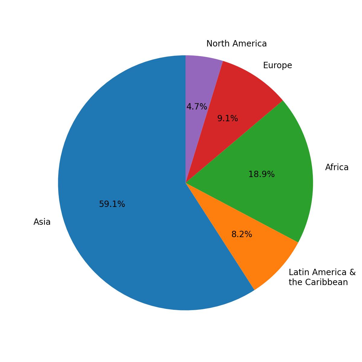
Ця діаграма відображає відсотковий розподіл населення за регіонами.
Попри свою наочність, кругові діаграми здебільшого слід уникати, оскільки вони спотворюють відображення даних. Категорія з великою кількістю елементів здається ще більшою, а категорія з малою кількістю — ще меншою.
Кругова діаграма з підписами
Використовуйте функцію pie() з модуля pyplot для створення кругової діаграми. Її єдиний обов'язковий параметр — це дані (x).
Параметр labels призначає підписи кожному сегменту та має бути послідовністю рядків.
123456import pandas as pd url = 'https://content-media-cdn.codefinity.com/courses/47339f29-4722-4e72-a0d4-6112c70ff738/population.csv' population_df = pd.read_csv(url) print(population_df)
Цей DataFrame містить населення кожного регіону.
123456import matplotlib.pyplot as plt import pandas as pd population_df = pd.read_csv('https://content-media-cdn.codefinity.com/courses/47339f29-4722-4e72-a0d4-6112c70ff738/population.csv') # Creating a pie chart and setting the labels for each region plt.pie(population_df['Population'], labels=population_df['Region']) plt.show()
Функція pie() була викликана з Series даних про населення, переданою як параметр x, а також з Series назв регіонів, які використовуються як підписи сегментів через параметр labels.
Додавання відсотків
Щоб відобразити відсоток кожного сегмента, використовуйте параметр autopct у функції pie(). Це визначає, як відсотки форматуються та показуються всередині діаграми.
Він приймає або рядок формату, або функцію. Тут розглядається використання рядка формату.
123456789import matplotlib.pyplot as plt import pandas as pd population_df = pd.read_csv('https://content-media-cdn.codefinity.com/courses/47339f29-4722-4e72-a0d4-6112c70ff738/population.csv') # Setting the label for each region and its percentage plt.pie(population_df['Population'], labels=population_df['Region'], autopct='%1.1f%%') plt.show()
Рядок формату
Рядок %1.1f%% форматує значення відсотків, які відображаються на круговій діаграмі.
%fозначає, що значення є числом з плаваючою комою;.1вказує одну цифру після десяткової крапки;- Подвійний
%забезпечує появу знака відсотка у виведенні.
Якщо бажаєте дослідити більше параметрів, ось pie() документація для вас.
Проведіть, щоб почати кодувати
- Використати відповідну функцію для створення кругової діаграми.
- Використати
incomesяк дані для кругової діаграми (перший аргумент). - Встановити підписи як
namesчерез другий аргумент. - Встановити формат відсотків як число з плаваючою комою з однією цифрою після коми через третій аргумент.
Рішення
Дякуємо за ваш відгук!
single
Запитати АІ
Запитати АІ

Запитайте про що завгодно або спробуйте одне із запропонованих запитань, щоб почати наш чат
