single
Налаштування Осей
Свайпніть щоб показати меню
Налаштування поділок
Для налаштування поділок використовуйте:
xticksдля осі x,yticksдля осі y.
Обидві приймають:
ticks— позиції поділок (порожній список видаляє поділки);labels— власний текст для цих позицій.
Додаткові іменовані аргументи дозволяють стилізувати підписи поділок (наприклад, обертання, розмір шрифту).
Нижче наведено графік із використанням цих інструментів:
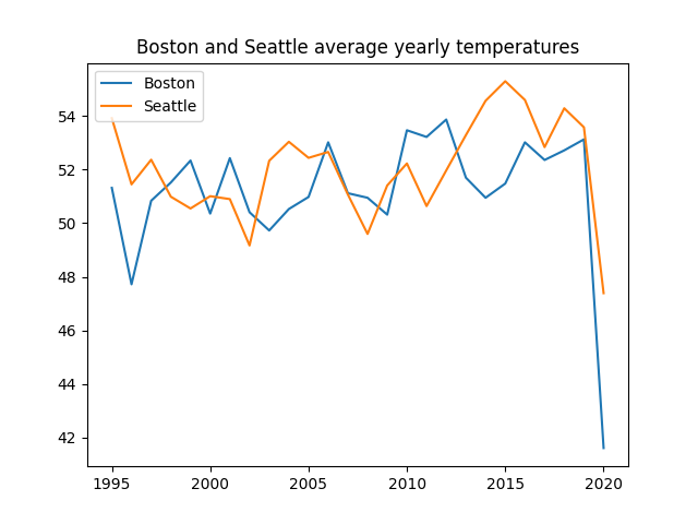
З цим графіком усе виглядає досить добре, однак було б краще мати більше років на осі x у цьому діапазоні (1995-2020). Для цього скористаємося xticks():
123456789101112131415import pandas as pd import matplotlib.pyplot as plt url = 'https://staging-content-media-cdn.codefinity.com/courses/47339f29-4722-4e72-a0d4-6112c70ff738/weather_data.csv' weather_df = pd.read_csv(url, index_col=0) plt.plot(weather_df['Boston'], label='Boston') plt.plot(weather_df['Seattle'], label='Seattle') plt.title('Boston and Seattle average yearly temperatures') plt.legend(loc='upper left') plt.xticks(range(1995, 2021, 2), rotation=30) plt.show()
На осі x відображається кожен другий рік завдяки range(1995, 2021, 2).
Мітки повернуті на 30° для покращення читабельності.
Мітки поділок також можна встановити вручну, передавши список у параметр labels.
Налаштування підписів осей
Використання xlabel() та ylabel() для встановлення підписів осей. Кожна функція приймає один рядок.
123456789101112131415import pandas as pd import matplotlib.pyplot as plt url = 'https://content-media-cdn.codefinity.com/courses/47339f29-4722-4e72-a0d4-6112c70ff738/weather_data.csv' weather_df = pd.read_csv(url, index_col=0) plt.plot(weather_df['Boston'], label='Boston') plt.plot(weather_df['Seattle'], label='Seattle') plt.title('Boston and Seattle average yearly temperatures') plt.legend(loc='upper left') plt.xticks(range(1995, 2021, 2), rotation=30) plt.ylabel('Temperature, °F') plt.show()
Можна стилізувати підписи за допомогою таких параметрів, як fontsize та color.
Аргумент loc визначає розташування підпису:
- Для підписів осі x:
'left','center','right'; - Для підписів осі y:
'top','center','bottom'.
Проведіть, щоб почати кодувати
- Використати відповідну функцію для встановлення
data_linearяк міток осі x. - Використати відповідну функцію для встановлення
'x'як підпису осі x. - Вказати
'right'як розташування підпису осі x. - Використати відповідну функцію для встановлення
'y'як підпису осі y. - Вказати
'top'як розташування підпису осі y. - Встановити параметр
rotationу значення0для підпису осі y.
Рішення
Дякуємо за ваш відгук!
single
Запитати АІ
Запитати АІ

Запитайте про що завгодно або спробуйте одне із запропонованих запитань, щоб почати наш чат
