single
KDE Plot
Свайпніть щоб показати меню
A Kernel Density Estimation (KDE) plot is a type of plot that visualizes the estimated probability density function of a continuous variable. Unlike a histogram, which displays data using discrete bars grouped into intervals, a KDE plot represents the distribution as a smooth, continuous curve based on all data points.
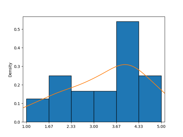
This example shows a histogram combined with a KDE plot (orange curve), providing a clearer approximation of the probability density function than the histogram alone.
In seaborn, the kdeplot() function makes creating KDE plots easy. Its key parameters—data, x, and y—work just like in countplot().
First Option
Only one of the parameters can be set by passing a sequence of values, allowing for individual customization across elements.
123456789101112import pandas as pd import matplotlib.pyplot as plt import seaborn as sns # Loading the dataset with the average yearly temperatures in Boston and Seattle url = 'https://content-media-cdn.codefinity.com/courses/47339f29-4722-4e72-a0d4-6112c70ff738/weather_data.csv' weather_df = pd.read_csv(url, index_col=0) # Creating a KDE plot setting only the data parameter sns.kdeplot(data=weather_df['Seattle'], fill=True) plt.show()
The data parameter is set by passing a Series object, and the fill parameter is used to fill the area under the curve, which is unfilled by default.
Second Option
It is also possible to set a 2D object like a DataFrame for data and a column name or a key if the data is a dictionary for x (vertical orientation) or y (horizontal orientation):
123456789101112import pandas as pd import matplotlib.pyplot as plt import seaborn as sns # Loading the dataset with the average yearly temperatures in Boston and Seattle url = 'https://content-media-cdn.codefinity.com/courses/47339f29-4722-4e72-a0d4-6112c70ff738/weather_data.csv' weather_df = pd.read_csv(url, index_col=0) # Creating a KDE plot setting both the data and x parameters sns.kdeplot(data=weather_df, x='Seattle', fill=True) plt.show()
The same results were achieved by passing the entire DataFrame as the data parameter and specifying the column name for the x parameter.
The KDE plot created exhibits a characteristic bell curve, closely resembling a normal distribution with a mean around 52°F.
In case you want to explore more about the KDE plot function, feel free to refer to kdeplot() documentation.
Проведіть, щоб почати кодувати
- Use the correct function to create a KDE plot.
- Use
countries_dfas the data for the plot (the first argument). - Set
'GDP per capita'as the column to use and the orientation to horizontal via the second argument. - Fill in the area under the curve via the third (rightmost) argument.
Рішення
Дякуємо за ваш відгук!
single
Запитати АІ
Запитати АІ

Запитайте про що завгодно або спробуйте одне із запропонованих запитань, щоб почати наш чат
