Секція 2. Розділ 2
single
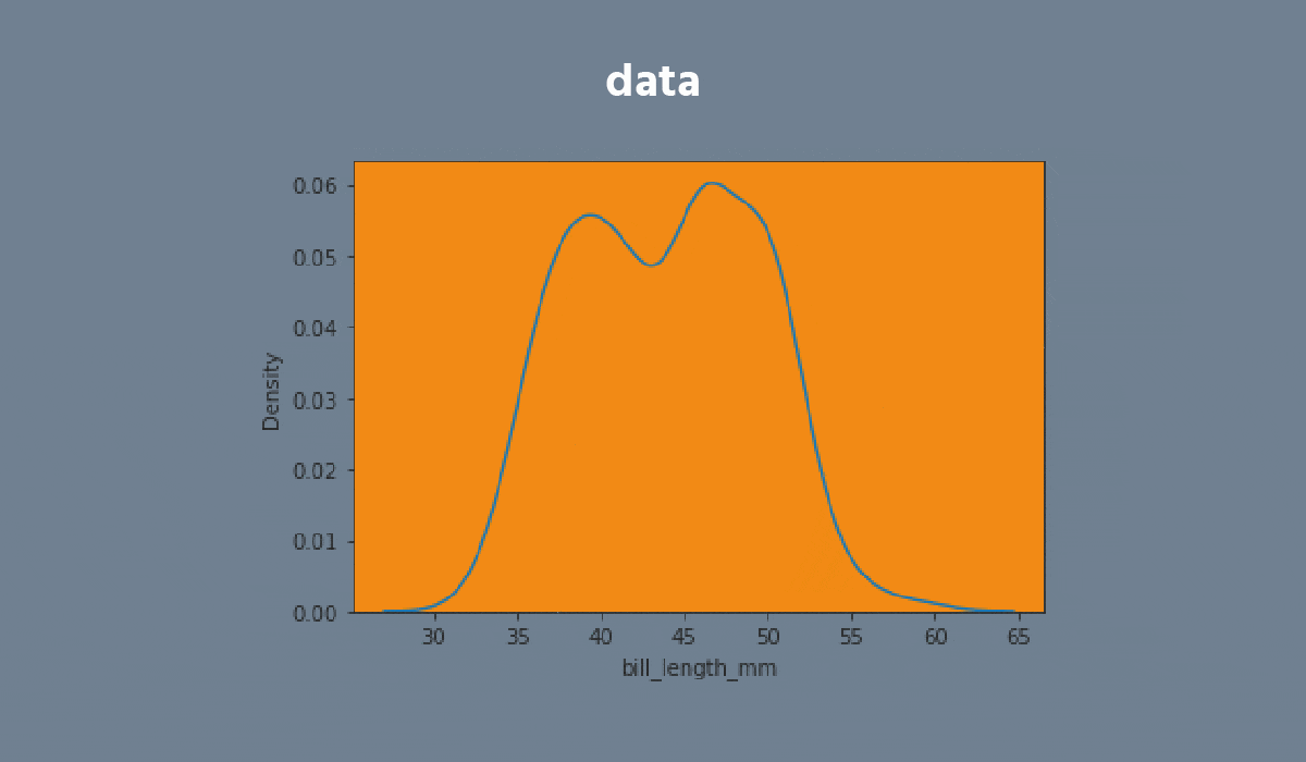
Kdeplot
Свайпніть щоб показати меню
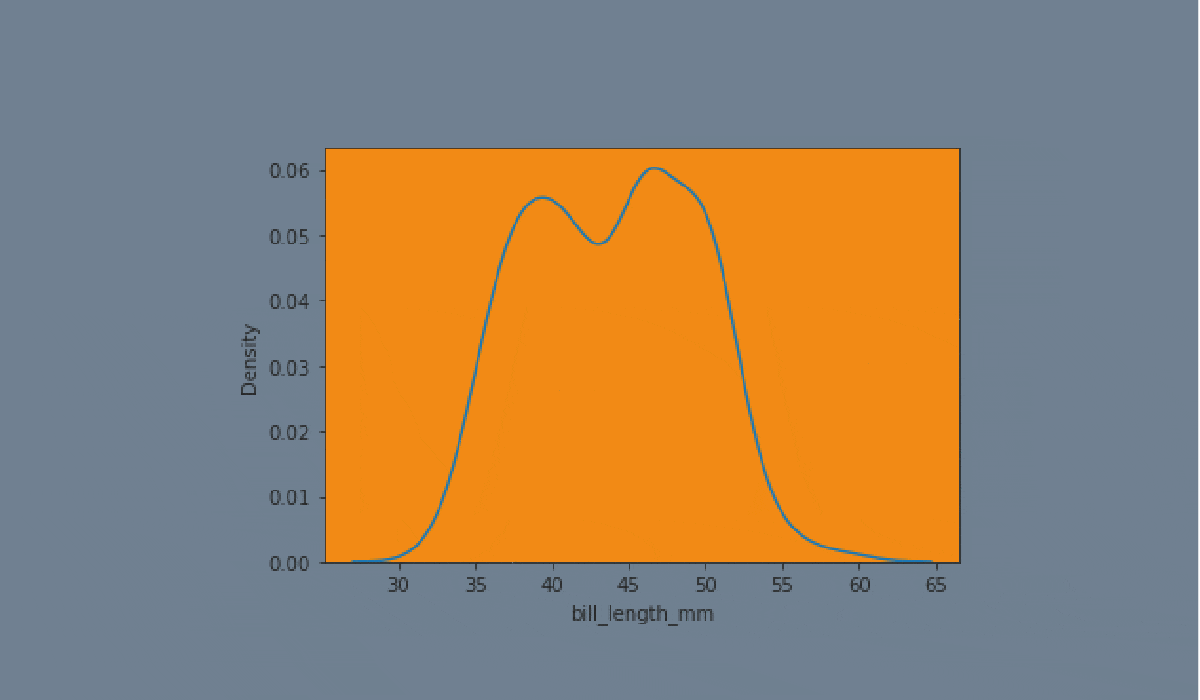
A kdeplot plot is a method for visualizing the distribution of observations in a dataset analogous to a histogram. KDE represents the data using a continuous probability density curve in one or more dimensions.


Завдання
Проведіть, щоб почати кодувати
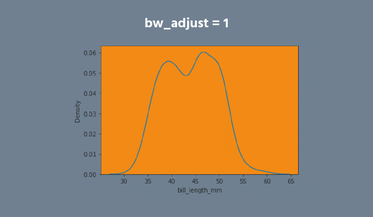
- Create the kdeplot using the
seabornlibrary:
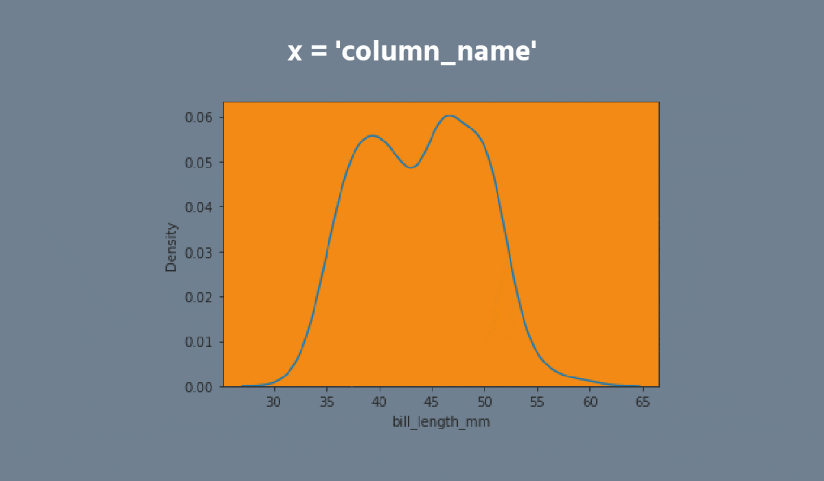
- Set the
xparameter equals the'max_temp'; - Set the
hueparameter equals the'month'; - Set the
multipleparameter equals the'stack'; - Disable the
legend; - Add the filling;
- Set the data;
- Display the plot.
Рішення
Все було зрозуміло?
Дякуємо за ваш відгук!
Секція 2. Розділ 2
single
Запитати АІ
Запитати АІ

Запитайте про що завгодно або спробуйте одне із запропонованих запитань, щоб почати наш чат
