Automating Charts
Swipe to show menu
Charts are shapes sitting on top of a worksheet, and like everything else in this chapter, every property you'd set by hand in the Format pane has a VBA equivalent.
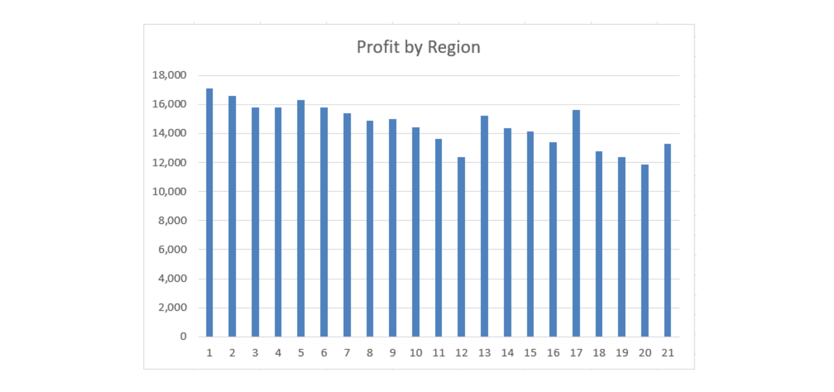
Creating a Chart
Sub BuildProfitChart()
    Dim ws As Worksheet
    Dim tbl As ListObject
    Dim chartObj As ChartObject

    Set ws = ThisWorkbook.Worksheets("Reports")
    Set tbl = ws.ListObjects("tblReports")

    Set chartObj = ws.Shapes.AddChart2(Style:=201, _
        XlChartType:=xlColumnClustered, _
        Left:=400, Top:=20, Width:=400, Height:=250).Chart.Parent

    With chartObj.Chart
        .SetSourceData Source:=tbl.ListColumns("Profit").Range
        .HasTitle = True
        .ChartTitle.Text = "Profit by Region"
    End With
End Sub

- AddChart2 creates the chart shape itself —
Style:=201picks a built-in visual style,XlChartType:=xlColumnClusteredpicks a standard column chart, and Left/Top/Width/Height position and size it on the worksheet in points, the same unit Excel uses internally for shape placement; - AddChart2 actually returns a Chart object, not the ChartObject container around it — the
.Chart.Parentat the end of that line is what steps back up to the container, which is the type chartObj is declared as; this quirk is easy to forget and worth copying exactly; SetSourceDatais what tells the otherwise-empty chart shape what data to plot — pointing it attbl.ListColumns("Profit").Rangemeans it charts the Profit column across every visible row of the Table;HasTitle = Truehas to be set beforeChartTitle.Textis assigned — trying to set the title text on a chart that doesn't have a title turns on yet will fail.
Updating Chart Data
When the underlying table grows, point the chart at the new range with SetSourceData rather than deleting and rebuilding it — this preserves any manual formatting already applied:
Dim cht As Chart
Set cht = ThisWorkbook.Worksheets("Reports").ChartObjects(1).Chart
cht.SetSourceData Source:=tbl.ListColumns("Profit").Range
ChartObjects(1) refers to the first chart shape on the sheet by position — fine when there's only one chart, but fragile the moment a second chart gets added, since "first" can silently mean something different after that. Referencing a chart by a name you set explicitly (chartObj.Name = "ProfitChart", then ChartObjects("ProfitChart")) is more resilient once a sheet has more than one chart on it.
Formatting Charts
With chartObj.Chart
    .ChartTitle.Font.Size = 14
    .ChartTitle.Font.Bold = True
    .SeriesCollection(1).Format.Fill.ForeColor.RGB = RGB(24, 106, 60)
    .Axes(xlValue).TickLabels.NumberFormat = "#,##0"
    .HasLegend = False
End With
SeriesCollection(1) is the first (and here, only) data series being plotted — its Format.Fill.ForeColor.RGB is what colors the actual bars, using the same RGB(...) function from Chapter 1's formatting examples. Axes(xlValue) refers specifically to the numeric axis (as opposed to xlCategory, the axis listing Region names) — applying NumberFormat there controls how the numbers along that axis display, exactly like NumberFormat on a worksheet cell. HasLegend = False removes the legend entirely, which is worth doing whenever a chart only has one series, since a legend explaining a single color adds clutter without adding information.
Task
- Run
BuildProfitChartand confirm a column chart appears showing Profit for all fifteen rows (all three months, unfiltered). - Add three lines to color the chart's bars dark green (RGB(24,106,60)) and remove the legend, as shown above.
- Filter tblReports to just January and re-run
SetSourceDataagainsttbl.ListColumns("Profit").Range— notice whether the chart respects the filter.
1. Running BuildProfitChart
- Copy the
Subexactly as shown in chapter and run it — no changes needed for this part. - You should see a chart appear on the Reports sheet plotting Profit for every row currently visible in the table.
2. Coloring bars and removing the legend
- Both properties belong to the chart object, not the worksheet —
chartObj.Chartis your entry point, same as the formatting example in the chapter. - The bar color lives on
SeriesCollection(1), since there's only one data series being plotted (Profit) —.Format.Fill.ForeColor.RGBis the specific property to set. - Removing the legend is a single Boolean property (
HasLegend), separate from the fill color line.
3. Filtering and re-running SetSourceData
- Apply an
AutoFilteron Month (Field:=1) restricted to "January" — the same technique from section 4.2. - Then call
SetSourceDataagain with the exact sametbl.ListColumns("Profit").Rangeexpression fromBuildProfitChart— nothing about that line needs to change. - Watch closely what happens to the chart afterward: does it shrink to only January's five regions, or does it still show all fifteen rows including the ones AutoFilter just hid? That observation is the actual point of this task, not just running the code.
Option Explicit

' Point 1 — run this exactly as shown in the chapter
Sub BuildProfitChart()
    Dim ws As Worksheet
    Dim tbl As ListObject
    Dim chartObj As ChartObject

    Set ws = ThisWorkbook.Worksheets("Reports")
    Set tbl = ws.ListObjects("tblReports")

    Set chartObj = ws.Shapes.AddChart2(Style:=201, _
        XlChartType:=xlColumnClustered, _
        Left:=400, Top:=20, Width:=400, Height:=250).Chart.Parent

    With chartObj.Chart
        .SetSourceData Source:=tbl.ListColumns("Profit").Range
        .HasTitle = True
        .ChartTitle.Text = "Profit by Region"
    End With
End Sub

' Point 2 — color the bars and remove the legend
Sub FormatProfitChart()
    Dim ws As Worksheet
    Dim chartObj As ChartObject

    Set ws = ThisWorkbook.Worksheets("Reports")
    Set chartObj = ws.ChartObjects(1)

    With chartObj.Chart
        .SeriesCollection(1).Format.Fill.ForeColor.RGB = RGB(24, 106, 60)
        .HasLegend = False
    End With
End Sub

' Point 3 — filter to January, then re-point the chart at the same range
Sub FilterJanuaryAndRefreshChart()
    Dim ws As Worksheet
    Dim tbl As ListObject
    Dim chartObj As ChartObject

    Set ws = ThisWorkbook.Worksheets("Reports")
    Set tbl = ws.ListObjects("tblReports")
    Set chartObj = ws.ChartObjects(1)

    tbl.Range.AutoFilter Field:=1, Criteria1:="January"

    chartObj.Chart.SetSourceData Source:=tbl.ListColumns("Profit").Range
End Sub
Run these in order: BuildProfitChart, then FormatProfitChart, then FilterJanuaryAndRefreshChart. For point 3 specifically — pay attention to what actually happens. Excel charts generally do respect an active AutoFilter, hiding the filtered-out rows' bars automatically, even without re-running SetSourceData at all. Re-running it here mostly just confirms the chart is still correctly pointed at the full column — the filter itself is what's doing the visual hiding, not the SetSourceData call. Worth testing with the filter both on and off to see the difference for yourself.

Running BuildProfitChart more than once creates a new chart each time without deleting the old one — so several charts end up stacked on top of each other. ChartObjects(1) always refers to the first one created, which may now be hidden underneath a newer copy. That's why formatting changes can run successfully but appear to do nothing visible.
Thanks for your feedback!
Ask AI

Ask AI

Ask anything or try one of the suggested questions to begin our chat
