single
Joint Plot
Swipe to show menu
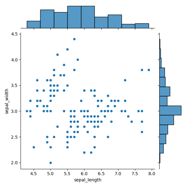
Joint plot is a rather unique plot, since it combines multiple plots. It is a chart that shows the relationship between two variables along with their individual distributions.
A joint plot combines three elements:
- a histogram on top (distribution of the x-variable);
- a histogram on the right (distribution of the y-variable);
- a scatter plot in the center (relationship between the two variables).
Here is an example:
Data for the Joint Plot
seaborn.jointplot() uses three key parameters:
data— the DataFrame,x— variable for the top histogram,y— variable for the right histogram.
x and y may be column names or array-like objects.
12345678import seaborn as sns import matplotlib.pyplot as plt # Loading the dataset with data about three different iris flowers species iris_df = sns.load_dataset("iris") sns.jointplot(data=iris_df, x="sepal_length", y="sepal_width") plt.show()
The example is recreated by passing a DataFrame to data and specifying column names for x and y.
Plot in the Middle
The kind parameter controls the central plot type.
Default: 'scatter'.
Other options include: 'kde', 'hist', 'hex', 'reg', 'resid'.
12345678import seaborn as sns import matplotlib.pyplot as plt # Loading the dataset with data about three different iris flowers species iris_df = sns.load_dataset("iris") sns.jointplot(data=iris_df, x="sepal_length", y="sepal_width", kind='reg') plt.show()
Plot Kinds
Besides scatter, you can choose:
- reg — adds a linear regression fit;
- resid — plots regression residuals;
- hist — bivariate histogram;
- kde — two-variable KDE;
- hex — hexbin plot showing density using colored hexagonal bins.
As usual, you can explore more options and parameters in jointplot() documentation.
Also, it is worth exploring the mentioned topics:
residplot() documentation;
Bivariate histogram example;
Hexbin plot example.
Swipe to start coding
- Use the correct function to create a joint plot.
- Use
weather_dfas the data for the plot (the first argument). - Set the
'Boston'column for the x-axis variable (the second argument). - Set the
'Seattle'column for the y-axis variable (the third argument). - Set the plot in the middle to have a regression line (the rightmost argument).
Solution
Thanks for your feedback!
single
Ask AI
Ask AI

Ask anything or try one of the suggested questions to begin our chat
