single
Countplot
Swipe to show menu
A countplot is a plot which creates columns (bars) that represent the number of entries for each category of a categorical list. It can be also thought of as a histogram of a categorical variable.
Here each column represents the number of Titanic passengers of each class. You may have already noticed that this plot is very similar to the bar chart. Indeed, it is a rather specific kind of bar chart representing the frequency of each category.
You still have to import the pyplot module from matplotlib and use the plt.show() function to display the plots created with seaborn.
In order to create a countplot with seaborn, you should use the countplot() function. There are several possible options to pass our data to this function.
Passing a 1D Array
The first option is to simply pass the value for the x parameter which can be some kind of an array:
12345678import seaborn as sns import matplotlib.pyplot as plt fruits = ['apple', 'banana', 'orange', 'apple', 'apple', 'apple', 'orange', 'banana', 'banana', 'banana', 'banana', 'banana', 'banana', 'banana'] sns.countplot(x=fruits) plt.show()
The function counts each unique element in the list and creates a column with the corresponding height.
The y parameter can be used instead of x to change the orientation of the plot from vertical to horizontal.
Passing a 2D Object
Another option is to use the data parameter combined with the x or y parameter. This approach is suitable for working with pandas DataFrame. You can pass a list of arrays or a DataFrame as the value for data. For x or y you can pass a name of the column in the DataFrame.
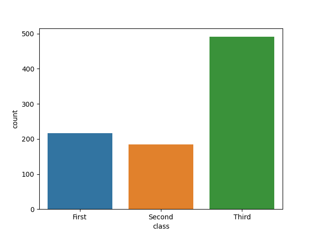
123456789import seaborn as sns import matplotlib.pyplot as plt # Loading a built-in dataset of the Titanic passengers titanic_df = sns.load_dataset('titanic') sns.countplot(data=titanic_df, x='class') plt.show()
In this example, the function creates a countplot using the 'class' column of the Titanic DataFrame, showing how many entries exist for each unique value in that column.
Swipe to start coding
- Import the
seabornlibrary with thesnsalias. - Import the
matplotlib.pyplotmodule with thepltalias. - Use the correct function to create a countplot.
- Use the
diamondsas the first argument to specify theDataFrame. - Use the
'cut'column of thediamondsDataFrame as the categories for the countplot and display the cateories on the y-axis via the second argument. - Display the plot using the correct function.
Solution
Thanks for your feedback!
single
Ask AI
Ask AI

Ask anything or try one of the suggested questions to begin our chat
