single
Pie Chart
Swipe to show menu
Pie chart is a graph which uses a circle divided into slices (segments) to represent the numerical proportion (percentage distribution) of nominal data.
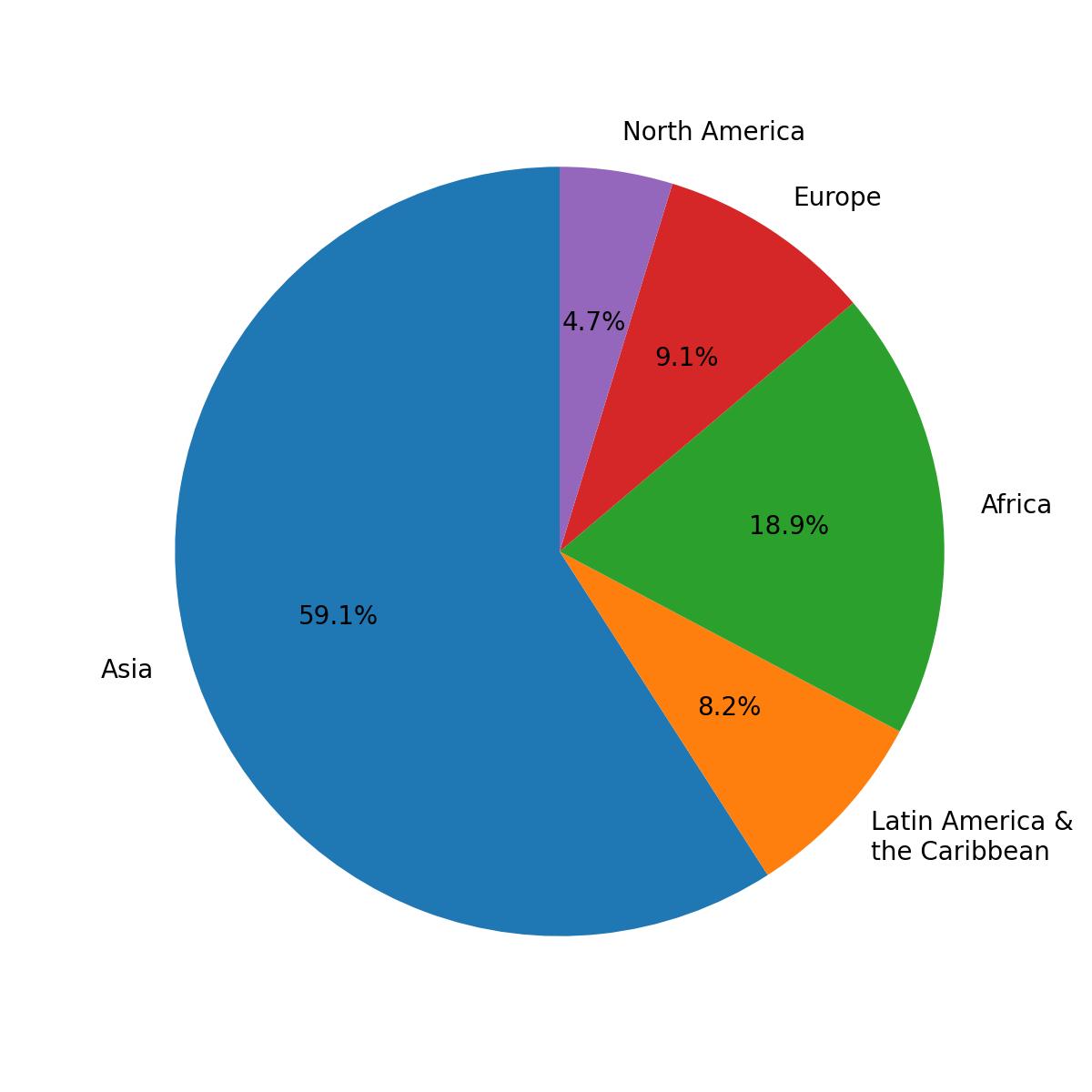
This chart represents the percentage distribution of the population by region.
Despite being neat, pie charts should mostly be avoided, since they distort the view of the data. A category with a lot of instances will seem even bigger, a category with few instances will seem even smaller.
Pie Chart with Labels
Use the pie() function from the pyplot module to create a pie chart. Its only required parameter is the data (x).
The labels parameter assigns labels to each segment and should be a sequence of strings.
123456import pandas as pd url = 'https://content-media-cdn.codefinity.com/courses/47339f29-4722-4e72-a0d4-6112c70ff738/population.csv' population_df = pd.read_csv(url) print(population_df)
This DataFrame contains the population of each region.
123456import matplotlib.pyplot as plt import pandas as pd population_df = pd.read_csv('https://content-media-cdn.codefinity.com/courses/47339f29-4722-4e72-a0d4-6112c70ff738/population.csv') # Creating a pie chart and setting the labels for each region plt.pie(population_df['Population'], labels=population_df['Region']) plt.show()
The pie() function was called with the Series of population data passed as the x parameter, and the Series of region names provided as segment labels using the labels parameter.
Adding Percentages
To display the percentage of each segment, use the autopct parameter in the pie() function. This controls how the percentages are formatted and shown inside the chart.
It accepts either a format string or a function. Here, the focus is on using a format string.
123456789import matplotlib.pyplot as plt import pandas as pd population_df = pd.read_csv('https://content-media-cdn.codefinity.com/courses/47339f29-4722-4e72-a0d4-6112c70ff738/population.csv') # Setting the label for each region and its percentage plt.pie(population_df['Population'], labels=population_df['Region'], autopct='%1.1f%%') plt.show()
Format String
The string %1.1f%% formats the percentage values shown in the pie chart.
%fmeans the value is a floating-point number;.1specifies one digit after the decimal point;- The double
%ensures a percent sign appears in the output.
If you want to explore more parameters, here is pie() documentation for you.
Swipe to start coding
- Use the correct function to create a pie chart.
- Use
incomesas the data for the pie chart (the first argument). - Set the labels to
namesvia the second argument. - Set the format of the percentage to a floating number with one digit after the decimal point via the third argument.
Solution
Thanks for your feedback!
single
Ask AI
Ask AI

Ask anything or try one of the suggested questions to begin our chat
