single
Axes Customization
Swipe to show menu
Ticks Customization
To customize ticks, use:
xticksfor the x-axis,yticksfor the y-axis.
Both accept:
ticks— positions of ticks (empty list removes ticks);labels— custom text for those positions.
Additional keyword arguments let you style tick labels (e.g., rotation, font size).
Below is a plot using these tools:
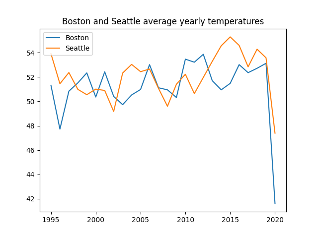
Everything seems to be pretty fine with this plot, however, it would be better to have more years on the x-axis in this range (1995-2020). Let's use xticks() for this purpose:
123456789101112131415import pandas as pd import matplotlib.pyplot as plt url = 'https://staging-content-media-cdn.codefinity.com/courses/47339f29-4722-4e72-a0d4-6112c70ff738/weather_data.csv' weather_df = pd.read_csv(url, index_col=0) plt.plot(weather_df['Boston'], label='Boston') plt.plot(weather_df['Seattle'], label='Seattle') plt.title('Boston and Seattle average yearly temperatures') plt.legend(loc='upper left') plt.xticks(range(1995, 2021, 2), rotation=30) plt.show()
Every second year is displayed on the x-axis thanks to range(1995, 2021, 2).
Labels are rotated 30° for readability.
Tick labels can also be manually set by passing a list to labels.
Axes Labels Customization
Use xlabel() and ylabel() to set axis labels. Each takes a single string.
123456789101112131415import pandas as pd import matplotlib.pyplot as plt url = 'https://content-media-cdn.codefinity.com/courses/47339f29-4722-4e72-a0d4-6112c70ff738/weather_data.csv' weather_df = pd.read_csv(url, index_col=0) plt.plot(weather_df['Boston'], label='Boston') plt.plot(weather_df['Seattle'], label='Seattle') plt.title('Boston and Seattle average yearly temperatures') plt.legend(loc='upper left') plt.xticks(range(1995, 2021, 2), rotation=30) plt.ylabel('Temperature, °F') plt.show()
You can style labels with options such as fontsize and color.
The loc argument controls label placement:
- For x-labels:
'left','center','right'; - For y-labels:
'top','center','bottom'.
Swipe to start coding
- Use the correct function to set
data_linearas x-axis ticks. - Use the correct function to set
'x'as the x-axis label. - Use
'right'as the location for the x-axis label. - Use the correct function to set
'y'as the y-axis label. - Use
'top'as the location for the y-axis label. - Set
rotationparameter to0for the y-axis label.
Solution
Thanks for your feedback!
single
Ask AI
Ask AI

Ask anything or try one of the suggested questions to begin our chat
