Notice: This page requires JavaScript to function properly.
Please enable JavaScript in your browser settings or update your browser.
Learn Barplot | Categorical Plot Types
Deep Dive into the seaborn Visualization

Swipe to show menu

book
Barplot

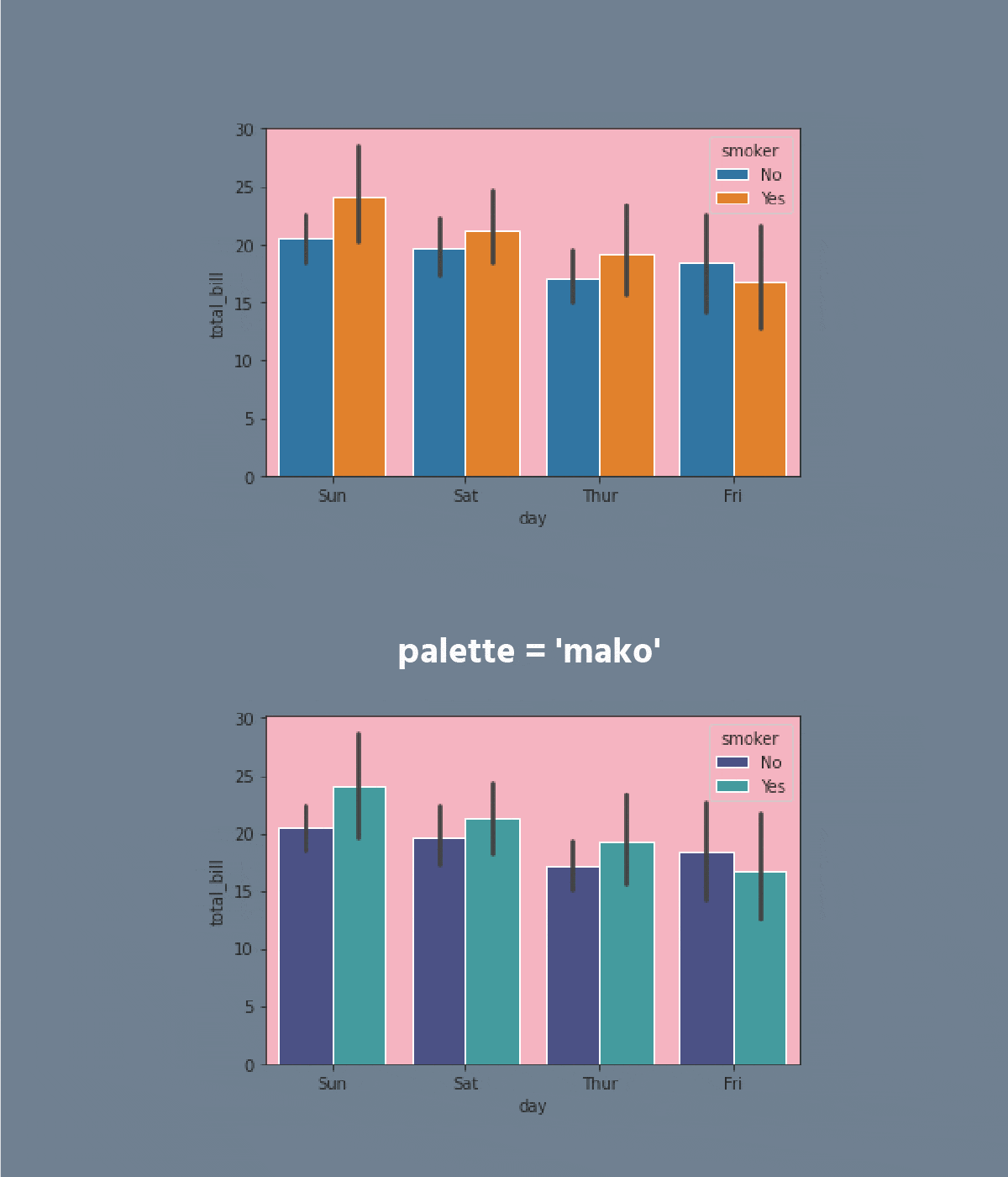
A barplot represents an estimate of the central tendency for a numeric variable with the height of each rectangle and provides some indication of the uncertainty around that estimate using error bars.

Bar plots include 0 in the quantitative axis range, and they are a good choice when 0 is a meaningful value for the quantitative variable, and you want to make comparisons against it.

carousel-imgcarousel-imgcarousel-imgcarousel-imgcarousel-imgcarousel-imgcarousel-imgcarousel-imgcarousel-img
Task

Swipe to start coding

  1. Set the 'ticks' style.
  2. Create the barplot using the seaborn library:
  • Set the x parameter equals the 'day';
  • Set the y parameter equals the 'total_bill';
  • Set the hue parameter equals the 'smoker';
  • Set the linewidth parameter equals 2.5;
  • Set the capsize parameter equals 0.1;
  • Set the 'pink' errcolor parameter;
  • Set the 'magma' palette;
  • Set the data;
  • Display the plot.

Solution

Switch to desktopSwitch to desktop for real-world practiceContinue from where you are using one of the options below
Everything was clear?

How can we improve it?

Thanks for your feedback!

SectionΒ 3. ChapterΒ 5
We're sorry to hear that something went wrong. What happened?

Ask AI

expand
ChatGPT

Ask anything or try one of the suggested questions to begin our chat

book
Barplot

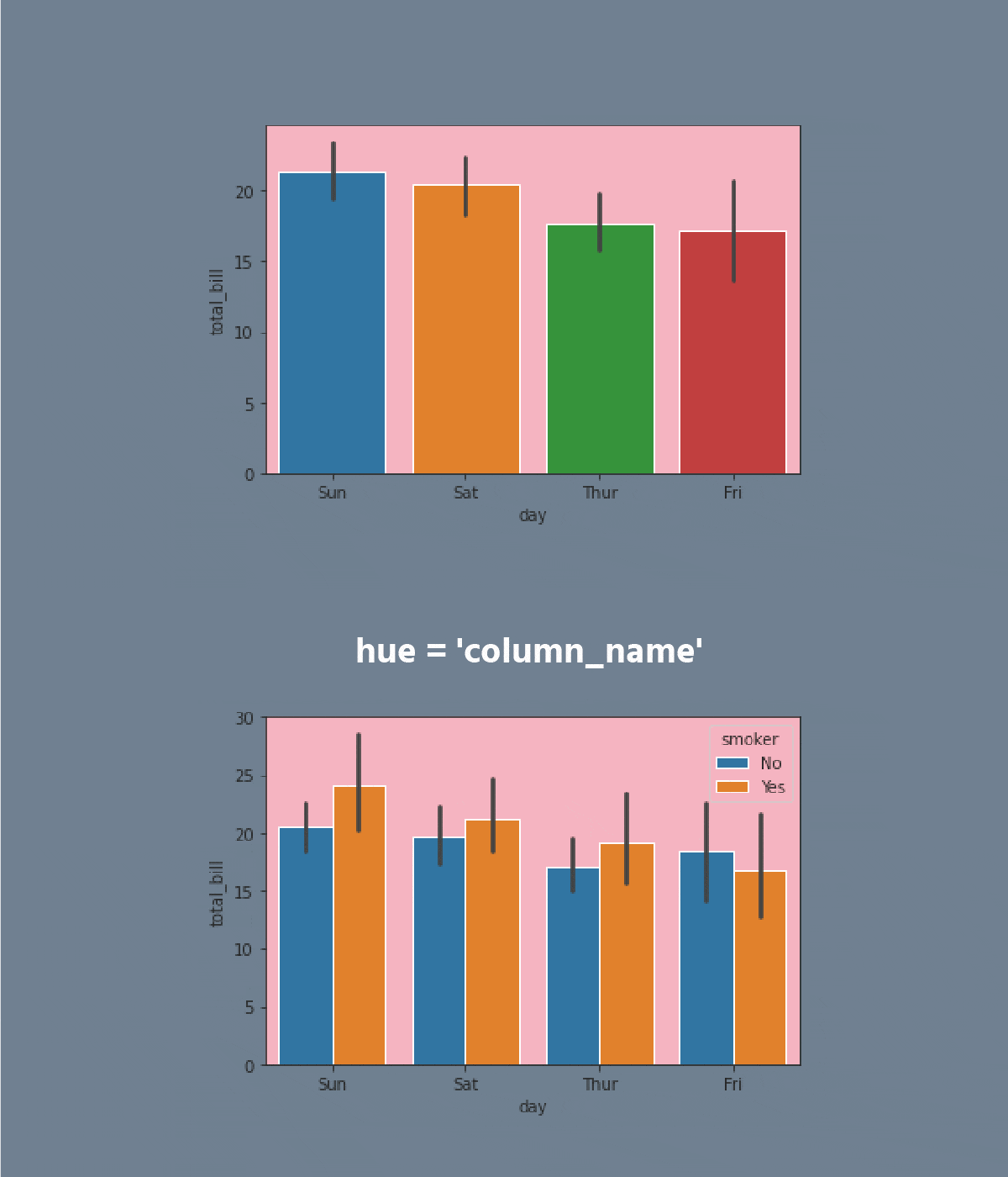
A barplot represents an estimate of the central tendency for a numeric variable with the height of each rectangle and provides some indication of the uncertainty around that estimate using error bars.

Bar plots include 0 in the quantitative axis range, and they are a good choice when 0 is a meaningful value for the quantitative variable, and you want to make comparisons against it.
carousel-imgcarousel-imgcarousel-imgcarousel-imgcarousel-imgcarousel-imgcarousel-imgcarousel-imgcarousel-img
Task

Swipe to start coding

  1. Set the 'ticks' style.
  2. Create the barplot using the seaborn library:
  • Set the x parameter equals the 'day';
  • Set the y parameter equals the 'total_bill';
  • Set the hue parameter equals the 'smoker';
  • Set the linewidth parameter equals 2.5;
  • Set the capsize parameter equals 0.1;
  • Set the 'pink' errcolor parameter;
  • Set the 'magma' palette;
  • Set the data;
  • Display the plot.

Solution

Switch to desktopSwitch to desktop for real-world practiceContinue from where you are using one of the options below
Everything was clear?

How can we improve it?

Thanks for your feedback!

SectionΒ 3. ChapterΒ 5
Switch to desktopSwitch to desktop for real-world practiceContinue from where you are using one of the options below
We're sorry to hear that something went wrong. What happened?
some-alt