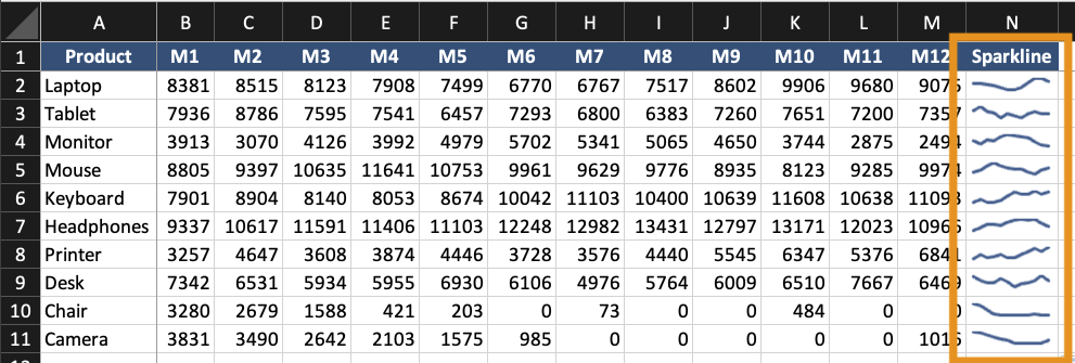
Sparklines and In-Cell Visualizations
Swipe to show menu
Sparklines are small charts placed inside a single cell. They show trends without using a full chart. They are useful when:
- You need compact trend indicators;
- Multiple rows require quick comparison;
- A dashboard needs summary visuals.
Sparklines do not replace full charts. They support them.
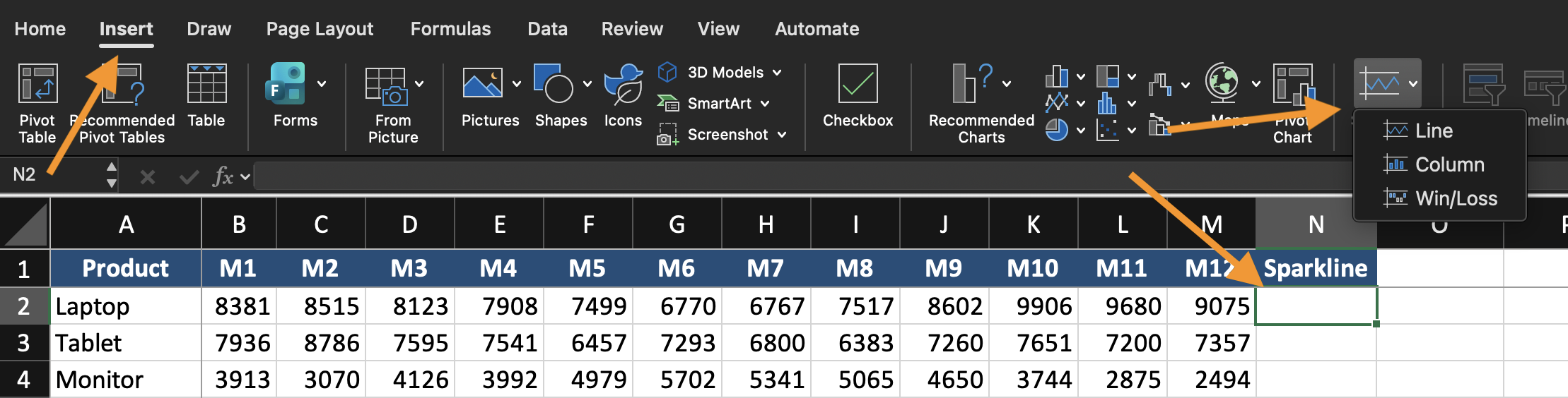
Creating Sparklines
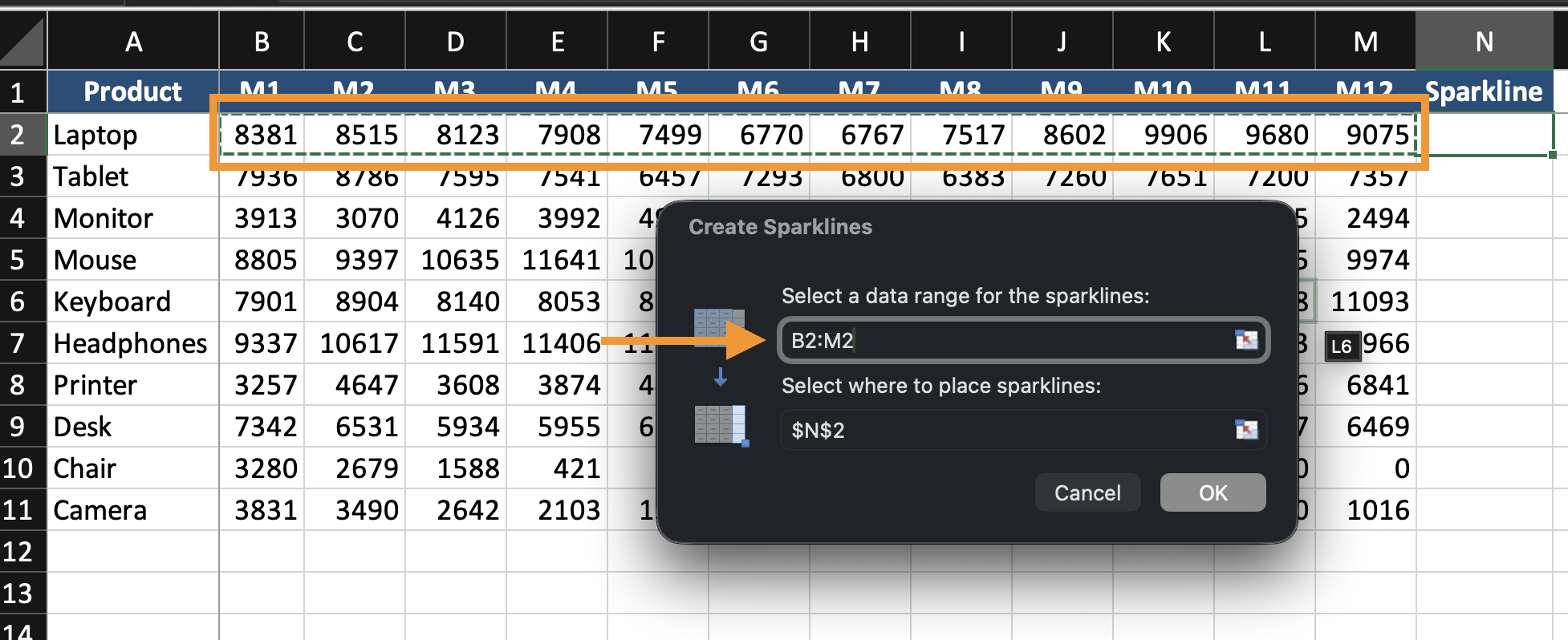
- Select the cell where the sparkline will appear;
- Go to Insert;
- Choose Line, Column, or Win/Loss Sparkline;
- Select the data range;
- Click OK.
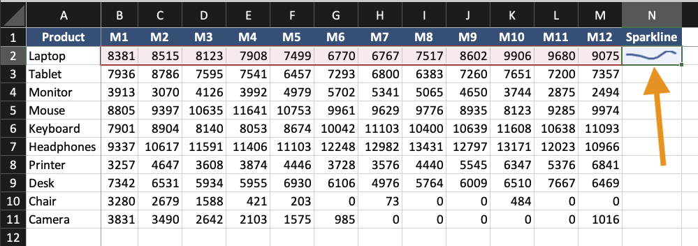
The sparkline appears inside the selected cell.
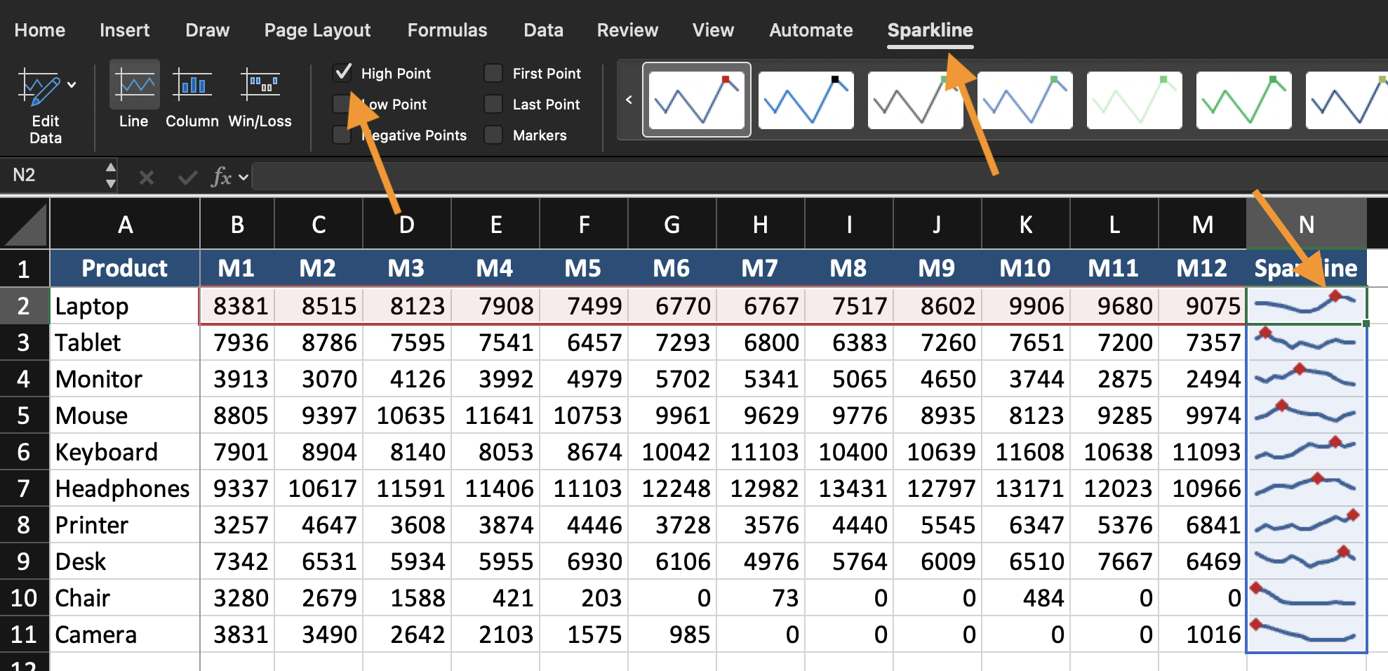
Formatting Sparklines
You can:
- Change sparkline type (Line, Column, Win/Loss);
- Highlight high or low points;
- Change color;
- Adjust axis settings.
Keep sparklines simple. They are indicators, not detailed charts.
When to Use In-Cell Visualization
Use sparklines when:
- Each row represents a separate trend;
- Space is limited;
- You need quick visual comparison across many records.
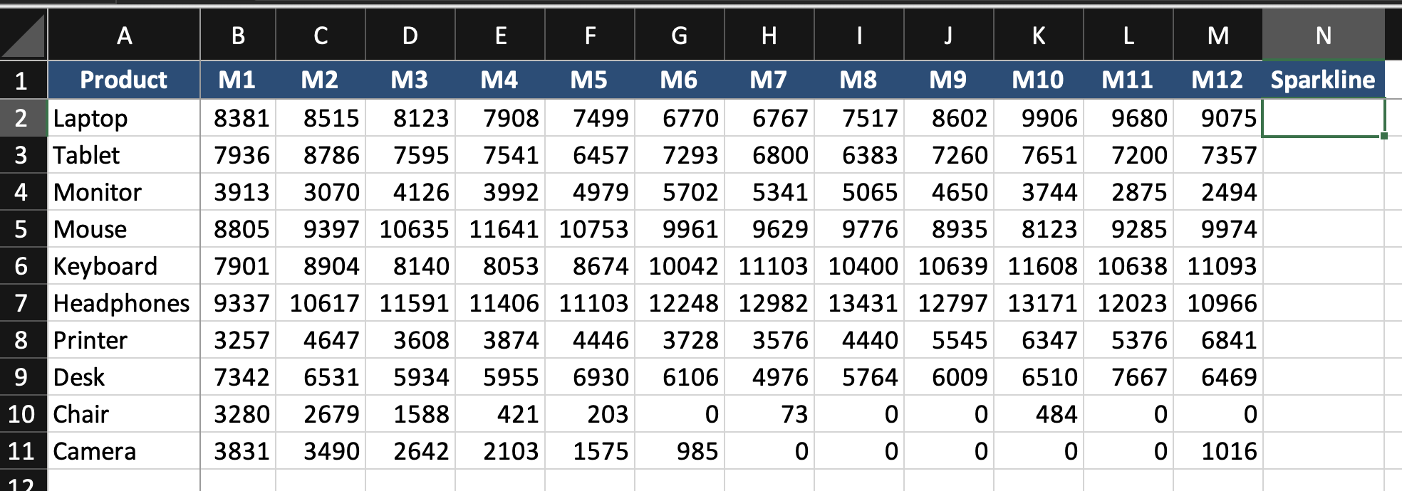
Task
Using the provided dataset:
- Insert Line Sparklines for each row of monthly data;
- Place them in the last column;
- Highlight the highest value;
- Compare trends across rows.
Goal: visualize trends inside cells without creating full charts.
Thanks for your feedback!
Ask AI
Ask AI

Ask anything or try one of the suggested questions to begin our chat
Sparklines and In-Cell Visualizations
Sparklines are small charts placed inside a single cell. They show trends without using a full chart. They are useful when:
- You need compact trend indicators;
- Multiple rows require quick comparison;
- A dashboard needs summary visuals.
Sparklines do not replace full charts. They support them.
Creating Sparklines
- Select the cell where the sparkline will appear;
- Go to Insert;
- Choose Line, Column, or Win/Loss Sparkline;
- Select the data range;
- Click OK.
The sparkline appears inside the selected cell.
Formatting Sparklines
You can:
- Change sparkline type (Line, Column, Win/Loss);
- Highlight high or low points;
- Change color;
- Adjust axis settings.
Keep sparklines simple. They are indicators, not detailed charts.
When to Use In-Cell Visualization
Use sparklines when:
- Each row represents a separate trend;
- Space is limited;
- You need quick visual comparison across many records.
Task
Using the provided dataset:
- Insert Line Sparklines for each row of monthly data;
- Place them in the last column;
- Highlight the highest value;
- Compare trends across rows.
Goal: visualize trends inside cells without creating full charts.
Thanks for your feedback!
