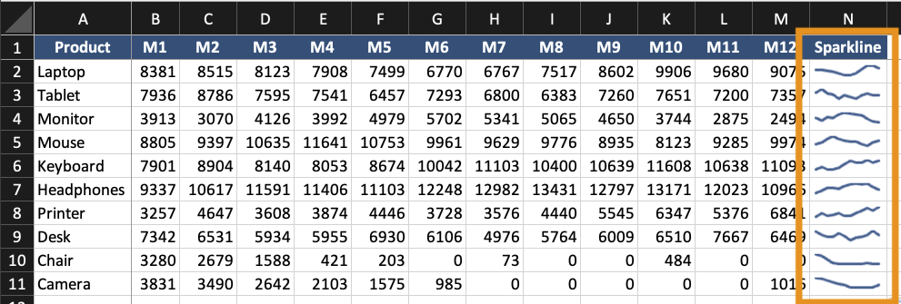
Sparklines and In-Cell Visualizations
Swipe to show menu
Sparklines are small charts placed inside a single cell. They show trends without using a full chart. They are useful when:
- You need compact trend indicators;
- Multiple rows require quick comparison;
- A dashboard needs summary visuals.
Sparklines do not replace full charts. They support them.
Creating Sparklines
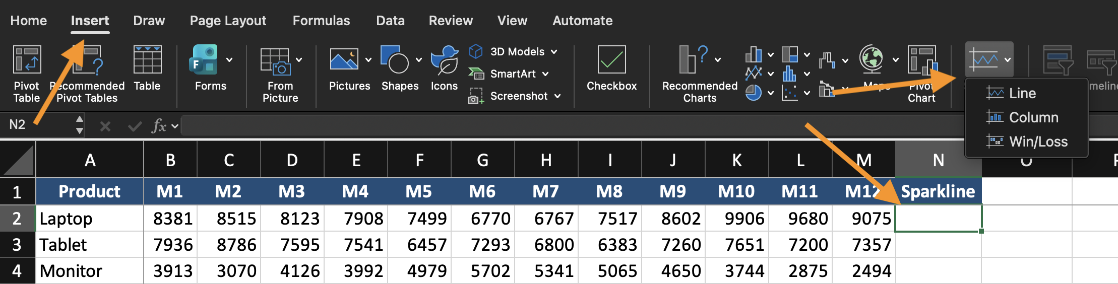
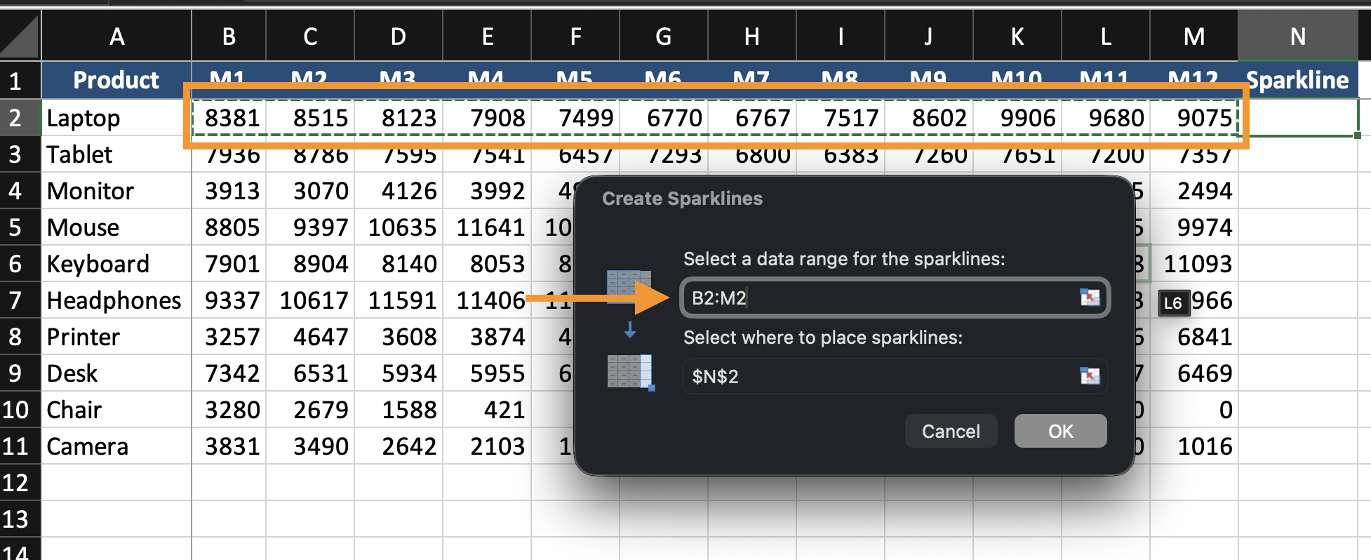
- Select the cell where the sparkline will appear;
- Go to Insert;
- Choose Line, Column, or Win/Loss Sparkline;
- Select the data range;
- Click OK.
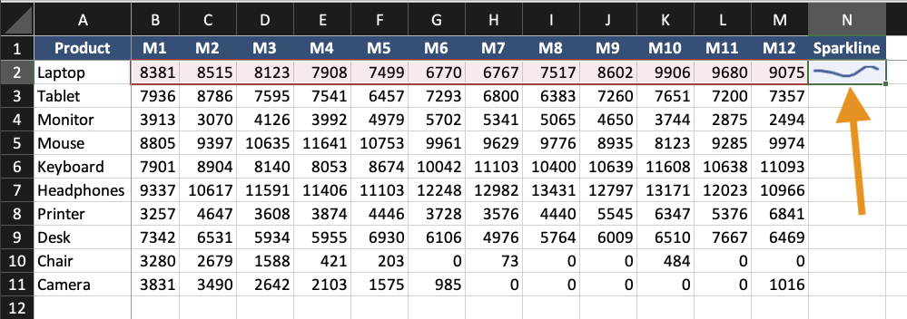
The sparkline appears inside the selected cell.
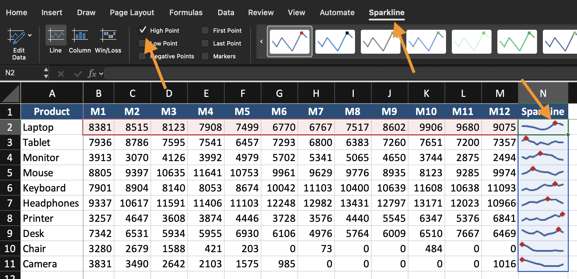
Formatting Sparklines
You can:
- Change sparkline type (Line, Column, Win/Loss);
- Highlight high or low points;
- Change color;
- Adjust axis settings.
Keep sparklines simple. They are indicators, not detailed charts.
When to Use In-Cell Visualization
Use sparklines when:
- Each row represents a separate trend;
- Space is limited;
- You need quick visual comparison across many records.
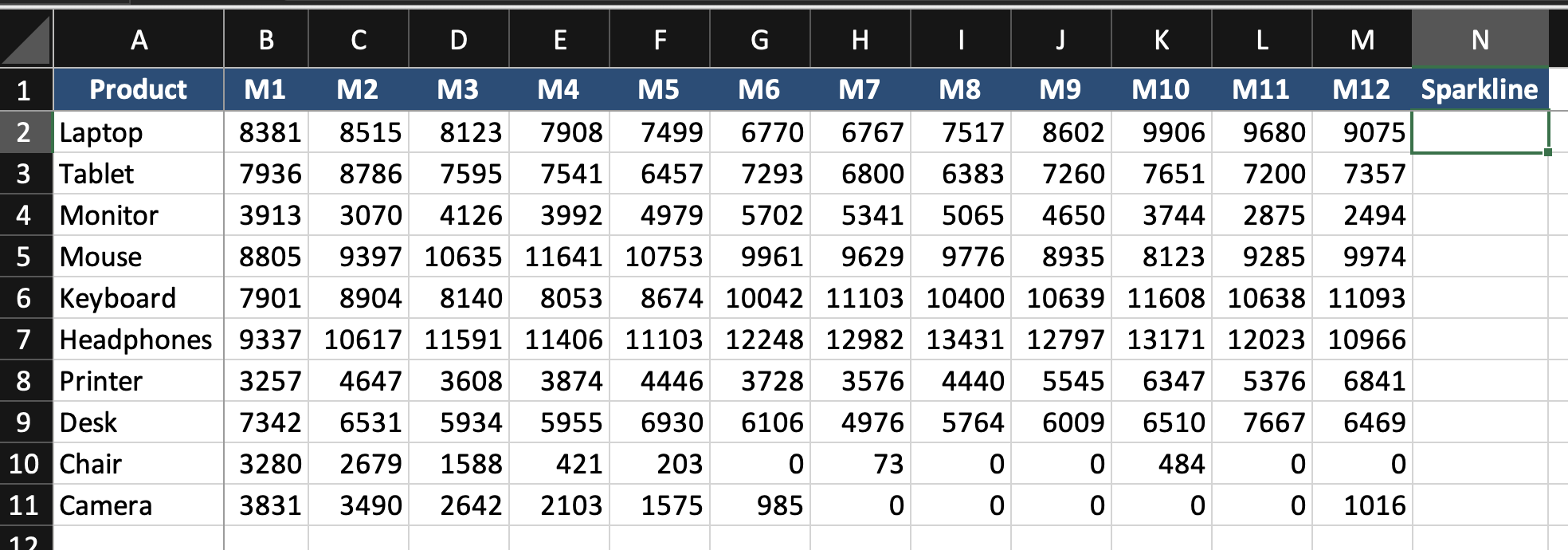
Using the provided dataset:
- Insert Line Sparklines for each row of monthly data;
- Place them in the last column;
- Highlight the highest value;
- Compare trends across rows.
Goal: visualize trends inside cells without creating full charts.
Everything was clear?
Thanks for your feedback!
Section 3. Chapter 4
Ask AI
Ask AI

Ask anything or try one of the suggested questions to begin our chat
Section 3. Chapter 4
