Sectie 4. Hoofdstuk 1
single
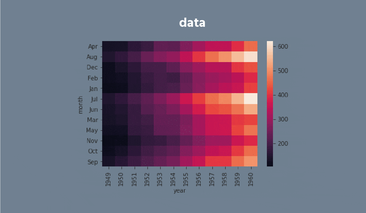
Heatmap
Veeg om het menu te tonen
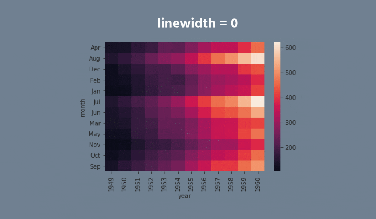
A heatmap is a plot of rectangular data as a color-encoded matrix. As a parameter, it takes a 2D dataset. That dataset can be coerced into an ndarray.
This is a great way to visualize data because it can show the relation between variables, including time. For instance, the number of flights through the years.


Taak
Veeg om te beginnen met coderen
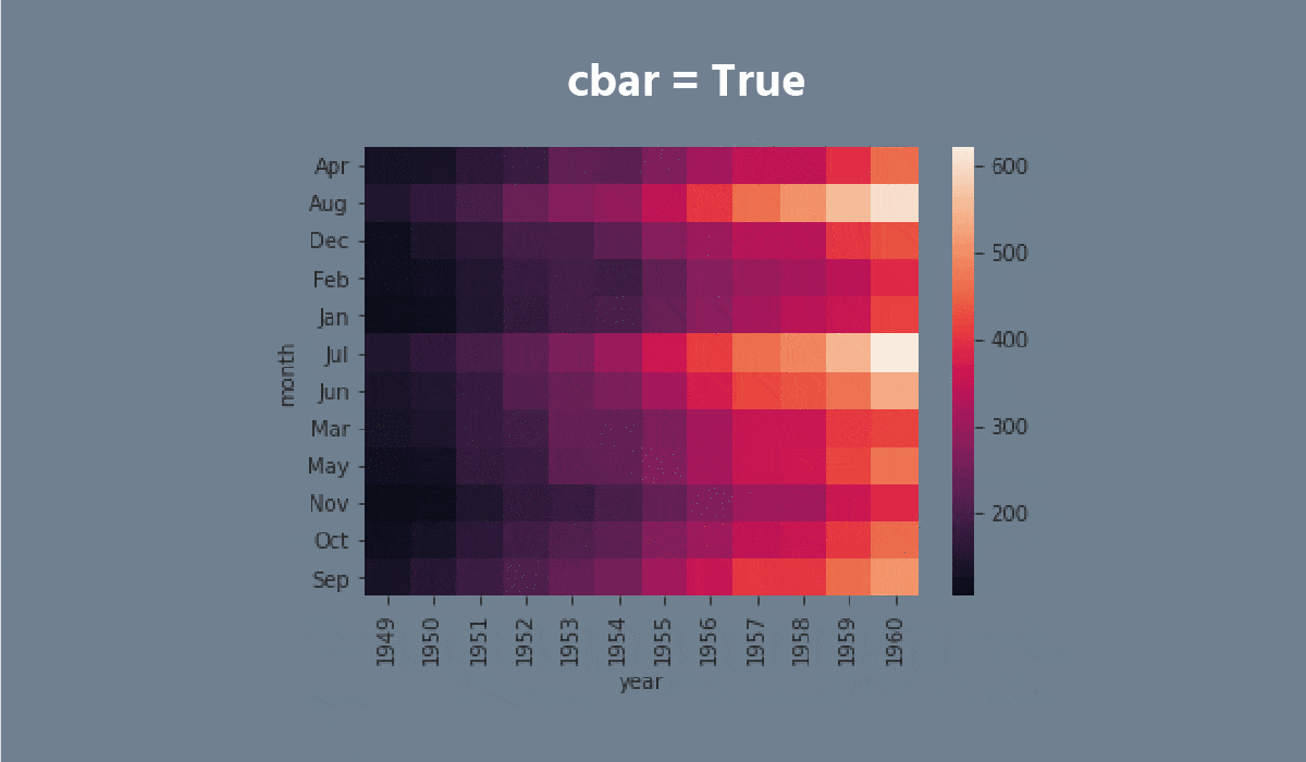
- Set the
'ticks'style with the'seagreen'figure.facecolor. - Create the
heatmapusing theseabornlibrary:
- Add the data for the
heatmap. You only need to input the name of the DataFrame (withoutdata = ...); - Set the
'viridis'cmapparameter; - Add the
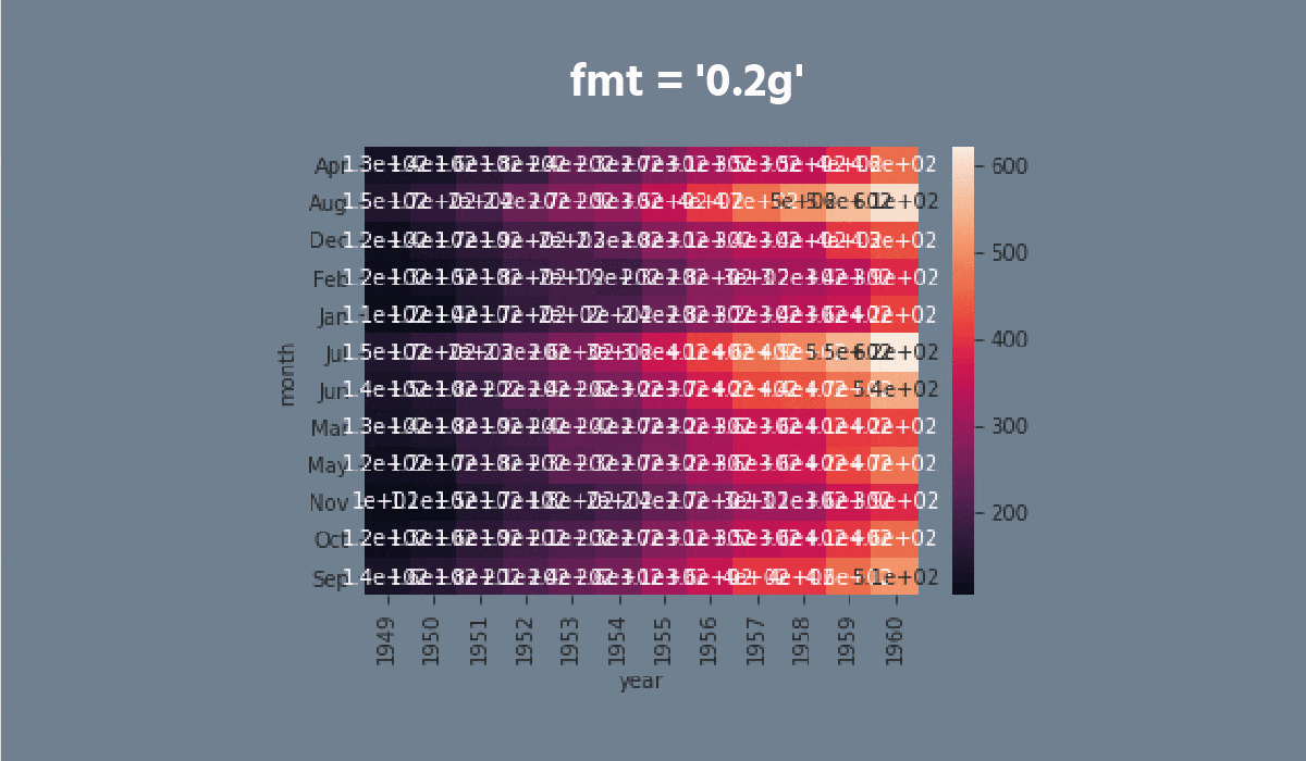
annotparameter; - Set the
fmtparameter equals the'0.99g'; - Set the
linecolorparameter equals the'plum'; - Display the plot.
Oplossing
Was alles duidelijk?
Bedankt voor je feedback!
Sectie 4. Hoofdstuk 1
single
Vraag AI
Vraag AI

Vraag wat u wilt of probeer een van de voorgestelde vragen om onze chat te starten.
